In this modern age of the digital world, where mobile traffic has outpaced desktop usage, the significance of designing responsive websites cannot be overemphasized. As the number of gadgets using the internet continues to increase (smartphones, tablets, laptops, and desktops) websites should be capable of adjusting to these varying screen sizes without any difficulty. This paper will discuss the mobile reign, the theory of responsive web design and the need to adopt mobile-first strategy to ensure that web content can be viewed on any device.
The Mobile-First Era
The overtaking of desktop internet usage by mobile internet usage has been a hallmark characteristic of the past decade. Statista data indicate that over half of the world’s internet traffic is currently through mobile devices. It can be shopping, social media, or research. People are becoming more and more dependent on their smartphones as the main tool of web browsing. This influx in mobile traffic has completely changed how websites should be constructed and developers should ensure that they give mobile users more priorities than desktop users.
During this mobile-first age, having a site that is good on a desktop does not suffice. To be really successful, a website must provide an excellent user experience (UX) on all screen sizes. The failure to optimize a mobile site could also lead to high bounces and reduced user engagement, as users may not easily or comfortably navigate it due to the lack of optimization of the site. Additionally, the search engine of Google has started to favor mobile-friendly websites, which means that mobile optimization is no longer a best-practice but an SEO requirement.
To developers, this change requires a shift in thinking about web design, where responsive design is the priority. This is aimed at making sure that websites are responsive to different screen sizes, which will allow the websites to present the best browsing experience, despite the type of device used.
What is Responsive Web Design?
Responsive Web Design (RWD) is a type of design that causes web content to appear attractive and work properly on every device. As opposed to developing various versions of a site to suit various devices, responsive web design enables the same site to be modified to suit the size and resolution of the device that is accessing the same site. This guarantees a smooth user experience in smartphones, tablets and desktops.
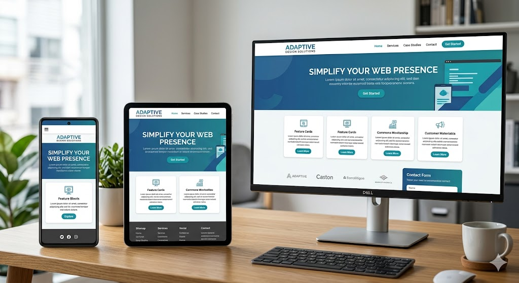
The responsive design is made possible by using a combination of flexible grids, media queries, and fluid layouts. With these methods, developers are able to develop websites that can dynamically adjust to the size of the user screen and thus there is no need to have special mobile sites or applications.
Mobile-First Philosophy: Its Importance
Mobile-first is a technique in web design that creates a design that is designed to display at the smallest screen size (usually mobile) and scales to larger sizes. This philosophy is founded on the realization that most users are able to access the internet through mobile devices, and therefore, the greatest priority ought to be to provide a positive mobile experience.
Advantages of Mobile-First Design
- Enhanced User Experience: A key objective of any web site is to achieve a great user experience. Mobile-first design is useful in simplifying the design process as it concentrates on what is required by the user on smaller screens. This frequently leads to less complicated, more natural user interfaces with reduced loading times and distractions.
- Shorter Load Times: Mobile-optimized websites tend to be less content- and functionality-heavy and thus have shorter load times. As mobile networks may be unstable or slower than desktop connections, load times are particularly important to attract and keep mobile users.
- SEO Benefits: As noted above, mobile-first indexing has led to Google ranking websites based on the mobile version of their sites. Mobile-first design will mean that your site is well-indexed to increase visibility and performance in the search engines.
- Cost and Time Efficiency: Mobile-first design helps to save the necessity to create mobile and desktop versions of a website. Developers can save time and resources as with responsive design, there is only one site to be maintained.
- Consistency Across Devices: Mobile-first guarantees that there is a consistent experience across devices. This will be significant in creating brand trust since the users will feel at ease and used to your site, regardless of whether they are using it on a mobile phone, a tablet or a desktop computer.
Important Ideas in Responsive Web Design
Implementing responsive web design has a number of important concepts and techniques that must be applied by developers. They consist of media queries, flexible layouts and fluid images.
Media Queries
One of the tools that are very critical in responsive web design is media queries. They enable the developers to implement various styles to a web site depending on the screen size, resolution and other aspects like the orientation (portrait or landscape) of the device used. The queries of the media allow the site to switch its layout, typography, and even conceal or reveal content based on the device.

An example of a simple media query would be:
@media only screen and (max-width: 768px) {
.header {
font-size: 18px;
}
.nav {
display: none;
}
}
This CSS condition will force a reduced font size on the header and conceal the navigation bar in the circumstance where the webpage is seen as a device with a screen width of 768 pixels or less.
Flexible Layouts
Responsive web design is based on flexible layouts. Compared to the fixed-width layouts which are pixel-based, flexible layouts are percentage-based layouts that adapt to varying screen sizes. This enables the elements such as columns, images and buttons to scale accordingly when the screen size is altered.
Here is an example of a two-column design with flexible widths:
.container {
display: flex;
flex-wrap: wrap;
}
.column {
flex: 1 1 50%;
}

In this case, the width of each column will be half of the width of the container, but as the width of the container narrows, the columns will narrow accordingly, so the layout can still be used in small screens.
Fluid Images
One of the most difficult aspects to make responsive is usually images. Fixed-size images may not fit a layout on a smaller display, or can be stretched out of proportion on a larger display. To address this problem, developers adopt fluid images, which change size with regard to the screen or container on which they are placed.
In order to make an image responsive, the use of the following CSS is possible:
img {
max-width: 100%;
height: auto;
}
This will make sure that the image will never grow wider than the container it is in and will always keep its aspect ratio even when resizing.
Mobile-First Web Design Best Practices
There are a few best practices that developers should follow to make sure that their website is mobile-first:
- Limit Content: Space is finite on smaller screens and in this case, it is important to focus on the content that is necessary. Do not overload the screen with information or other items that are not necessary. Get down to the message and functionality of your webpage.
- Streamline Navigation: Mobile displays need simplified navigation. Make it easier on your users to navigate your site by using a hamburger menu, a collapsible sidebar or a sticky navigation bar.
- Touch-Friendly Design: Mobile devices are operated by touches; therefore, make buttons, links and forms as large as possible to be tapped. Small clickable objects should be avoided, since they are hard to interact with on a mobile device.
- Test on Multiple Devices: It is important to test your site on different types of devices and screen resolutions to make sure that it works on all of them. Simulate various devices with tools, such as the Developer Tools of Chrome, or online services, such as BrowserStack.
- Remember Performance: Mobile users might lack access to high-speed internet connections, and it is advisable to make your website as fast as possible. Minimise the size of images, compress CSS and JavaScript files, and minimise the number of HTTP requests to optimise load times.
Conclusion
With mobile internet adoption still taking center stage, there has never been a need to have a responsive web design more than ever before. Mobile-first approach will make sure that sites provide a smooth, optimized experience on all devices. With the adoption of major principles like media queries, flexible layouts, and fluid images, developers are able to create websites, which are functional and user-friendly, irrespective of the size of the screen.
Developers can create mobile-first websites, not only to satisfy the demands of current mobile-centric internet users, but also to future-proof their websites in a constantly changing digital environment. With more and more devices on the market, responsive web design will be critical in ensuring smooth browsing experience to all users, anywhere.
With these principles and best practices, developers will be able to develop websites that are not only mobile-friendly, but also universally accessible across devices and therefore they will not be left behind in this rapidly changing digital world.