A product page can contain accurate specifications, a sensible price, and a clear description yet still feel incomplete when the images do not answer the buyer’s obvious questions. One photo may show the item on a white background, but shoppers often also need to understand scale, texture, use, colour, and how the product fits into a real setting. Adding more pictures does not automatically solve that problem. Extra images only help when each one has a defined role and stays faithful to the item being sold.
That makes product-image planning a merchandising task rather than a decoration task. Store owners need a repeatable way to decide which visual gaps exist, which shots deserve real photography, and which supporting concepts can be explored before publishing. When a missing scene needs to be prototyped from a written brief or an existing reference, an Image 2.5 API workflow can provide one route for exploring that direction. The final standard should remain strict: every image must help a shopper understand the product without inventing features, hiding limitations, or creating expectations the listing cannot support.
Assign a Job to Every Product Image
Start by treating the image gallery as a sequence of questions rather than a collection of attractive pictures. The main image should answer “What is it?” quickly. Additional images can then answer “What does the other side look like?”, “How large is it?”, “What detail matters?”, or “How might it appear in use?” This approach aligns with the way ecommerce platforms structure product galleries: one primary image supported by additional views rather than several interchangeable hero shots.
Before creating anything new, audit the existing gallery. Write one short purpose beside every asset. If two images perform the same job, one may be unnecessary. If an important question has no visual answer, that gap becomes a candidate for a new image. For a backpack, for example, a front view and side view may establish shape, while a close-up can show the zipper and fabric. A contextual scene can then explain scale and use without replacing the factual product views.
Keep factual and atmospheric images separate in your planning. A detail shot should be judged for accuracy. A lifestyle image should be judged for context and plausibility. Mixing those purposes makes review harder because a dramatic background may distract from a product whose shape has subtly changed.
Build Supporting Scenes Without Changing the Product
Lifestyle and campaign-style images are useful when they clarify context, but they create a specific risk: the environment may look convincing while the product itself drifts away from the real item. A useful workflow therefore begins by deciding which attributes are fixed and which elements can change.
1. Define the Features That Must Stay
List visible characteristics that identify the item. For a shoe, that could include sole shape, lace pattern, panel colours, logo position, and toe profile. For furniture, it may be leg shape, material, dimensions, and hardware placement. Keep the list short enough to review visually. If a feature would change what the customer believes they are buying, it belongs on the fixed list.
2. Describe the Context Separately
Write the environment as a second instruction rather than blending it into the product description. A useful brief might specify a compact coffee maker on a bright apartment kitchen counter, photographed at eye level with space on the right for promotional copy. The setting, camera view, and empty space may vary; the machine itself should not.
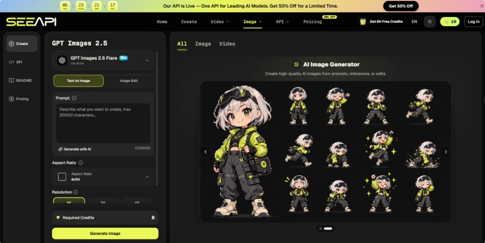
When an approved product photograph already exists, the ChatGPT Images 2.5 API can be used to explore a new setting from that reference. Provide the product image, describe the environment and framing you want changed, and name the visible product details that should remain stable. After generation, compare silhouette, colours, controls, labels, and other recognisable features against the source before the image enters the listing workflow. A visually appealing result that alters a defining feature should be revised or rejected.
3. Check the Scene for Implied Claims
Context can accidentally promise more than the description does. A small speaker shown beside a swimming pool may imply water resistance. A storage box packed with more items than its stated capacity may distort scale. A chair placed in a commercial setting may suggest a use case that its specifications do not support. Review the background for these implied messages, not just for visual quality.
4. Test the Image at Listing Size
Product images are often reviewed at large preview size, while shoppers first encounter them as thumbnails or within a constrained product layout. Reduce the image to its likely display size. Confirm that the product remains recognisable, the background does not overwhelm it, and important features are still visible. If the product disappears into the scene, the image may work as campaign art but not as a useful gallery asset.
Match Image Types to Buyer Questions
A strong gallery usually mixes evidence and context. The evidence images show the actual object: front, back, side, close-up, colour variation, or size reference. Context images help buyers imagine use. The balance depends on the product. A technical item with several ports may need more detail views, while a decorative object may benefit from one or two room settings after its shape and finish are already clear.
Use a simple pass test for every new asset. Keep it if it answers a buyer question that another image does not answer, preserves important product details, and still works at the intended crop. Revise it if the purpose is useful but one bounded issue—such as clutter, framing, or background colour—gets in the way. Remove it if the product is inaccurate, the scene implies unsupported features, or the image adds no new information.
Consider a desk lamp listing with five images. If four are nearly identical three-quarter views, the gallery looks full without becoming informative. Replacing two of those images with a close-up of the controls and a scene that shows the lamp beside a laptop gives the shopper two new pieces of information: how it is operated and how much space it occupies. The improvement comes from coverage, not image count.
It is also worth reviewing the sequence. Place the most factual, easily recognised view first, followed by angles and details that reduce uncertainty. Context can appear after the shopper understands what the item actually is. This prevents a stylised scene from becoming the only mental model of the product.
Keep Product Images Useful After Publishing
Product-image work should end with a review routine, not with an upload. Check the live page on desktop and mobile, because crops, thumbnail sizes, and surrounding text can change how an image reads. Verify that additional images appear in a sensible order and that the main product remains easy to identify. When variants exist, confirm that images do not create confusion between colours, sizes, or models.
A reusable gallery standard makes future listings easier to manage. Define the minimum evidence needed for your catalogue—such as a main view, alternative angle, important detail, and scale or context image—then add product-specific shots only when they answer a real question. Keep source photographs and approved references so later edits can be checked against something factual. Over time, the store gains a more consistent visual system: images are added because they reduce uncertainty, not simply because empty gallery slots are available. That discipline helps product pages remain informative even as campaigns, seasonal backgrounds, and merchandising styles change.