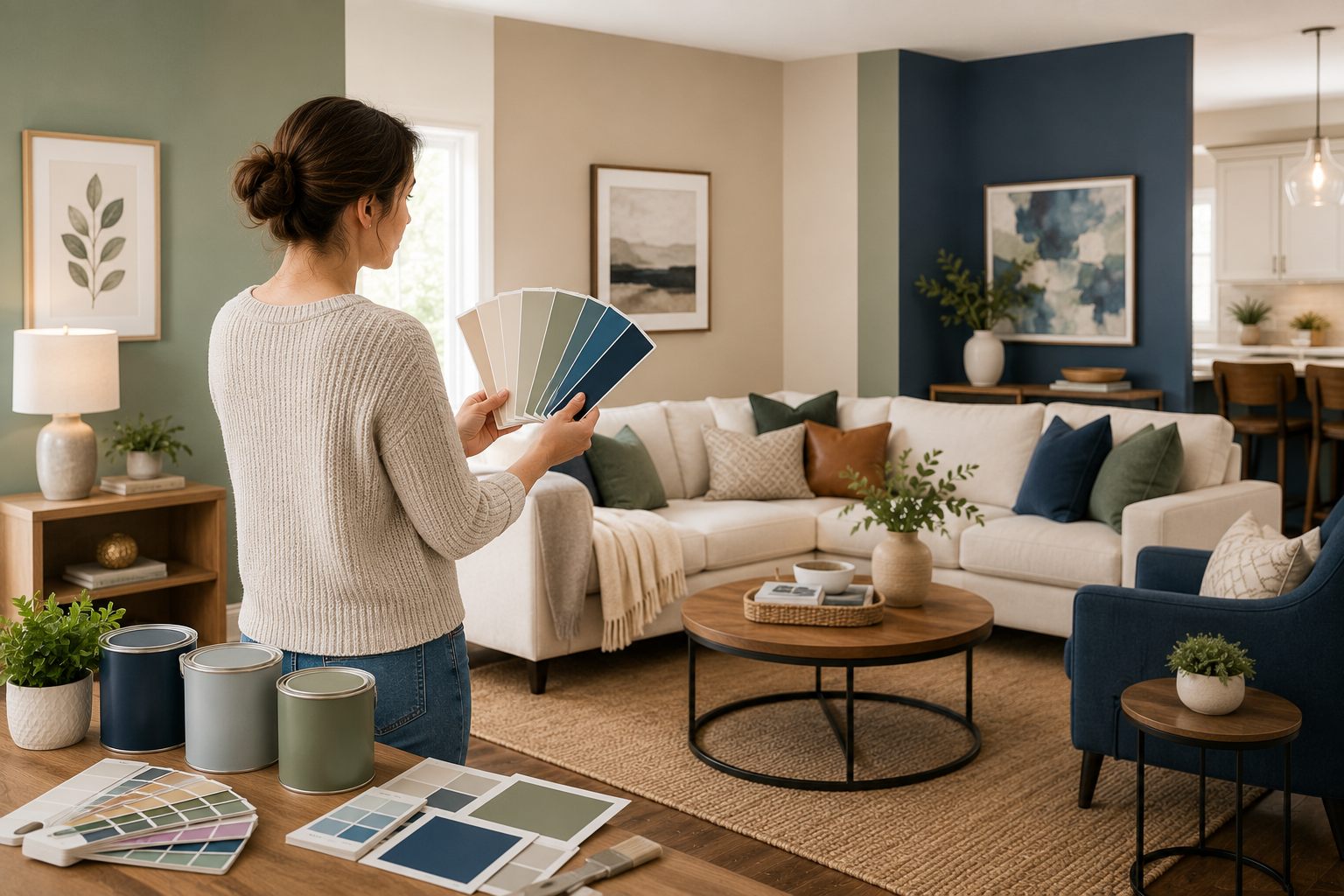
Making a decision on paint colors can be daunting, but color can be a great way to turn your home into a cohesive and inviting environment. Paint is much more than a decorative accessory—it helps to dictate the character of each room and make it more functional. The use of the right color can help to make a small room appear spacious, a dark room appear brighter, and a very busy space appear calm and balanced. Color is so important to both mood and perception, it’s important to take the time to consider what color you want, and not just pick it up from a paint chip.
Choosing paint involves more than just picking a color, as there is a variety of factors to consider, from lighting to room size, décor to finishes. We will guide you through 11 tips of design and psychology that will help you confidently choose the Right Paint Colors for Every Room in your home. At the end of this course, you will be able to design interior spaces that are aesthetically pleasing, comfortable, and functional, enabling your home to express your personality whilst being classics.
Tip 1: Make Sure You Know the Effects of Light
One of the most significant aspects of the appearance of paint colors is lighting. The colour under natural light will vary throughout the day—for the same colour, morning will be warmer, evening cooler. Lights also have their effect: warmer lights, like incandescent bulbs, will highlight warm colors, and cooler lights, such as fluorescent, will highlight cooler colors. Test paint samples throughout the day before committing to a colour to see how the colours change with the different light conditions.
Also look at the direction that your room is facing. Rooms that are east or north facing tend to be cooler, and can be filled with warmer colors, whereas rooms to the south or west can be filled with loads of sunlight, and may be complementary with cooler colors. The east-facing rooms are light in the morning but get dark at night, and the west-facing rooms are dark in the morning and bright at night. These details will help you make sure that your selected color is the same and attractive all day long, preventing you from any unpleasant surprises when it’s time to paint.
Tip 2: Take Into Consideration the Size of the Space
The colors used in the painting can make a room look bigger or smaller. Lighter shades open up small rooms to look larger and airier. On the other hand, darker shades can create a sense of depth and warmth, which is ideal for larger rooms, such as lounges or bedrooms, where a cosier atmosphere is sought. To create balance, make the walls lighter, and the accents or ceiling darker.
Another factor to consider is the height of the room. Paint the ceiling at a lower height to make it look taller and a darker ceiling colour in a room to give it a more solid feel. The right use of color creates the illusion of size, rather than changing the actual size, and can be used to create the desired atmosphere in a room.
Tip 3: Learn About Color Psychology – What Colors Convey
Colors have an impact on mood and behavior. Colors such as reds, oranges, and yellows are warm colors that are associated with energy and sociability and they are good colors for kitchens or dining areas. Cool colours like blue and green have a soothing effect and are ideal for bedrooms or bathrooms. Beige, gray, and white are neutral hues that can be used to create a sense of calm and simplicity, making them an ideal choice for creating a neutral background that can be accentuated with bold colors and patterns.
However, try to go beyond the associations and consider your own feelings about colors. Yellow can be a cheerful colour for some, but overwhelming for others. The emotional association with a color is as significant as its psychological impact. When selecting shades, opt for those that are a match for your home’s aesthetic, and blend in with your decor.
Tip 4: Match with Pre-Existing Décor
Paint should match your furniture, flooring and accessories. First determine the colors that are important in your home decorating scheme, and then choose color patterns that work well together or contrast well. For instance, if the sofa is dark navy, a light grey wall can complement it with style and sophistication. For warm-toned wood floorings, warm or neutral grays and browns can complement their natural beauty.
Artwork, rugs and textiles are not to be overlooked. These elements may set the accent colors that you can inspire your wall palette from. They should match with your current decor so there is a sense of harmony to the design, not a mismatch.
Tip 5: Select the Appropriate Paint Type
The effects of paint finishes are apparent in their appearance and durability. Matte finishes are soft, reflective-free and are great for concealing imperfections, but are not stain resistant. Satin and eggshell finishes are a balance, with a slight sheen and relatively easy to clean, use in living rooms and hallways. Glossy finishes are light-reflecting and accentuate details—good for trims and doors, but not walls.
Think about the purpose of each room. The semi-gloss surface options in the kitchen and bathrooms are washable, and matte or eggshell are better choices for the bedrooms. A perfect match between finish and function will make a paint not only look good, but function well over time.
Tip 6: Hone Your Craft
Don’t just “eye” it by using paint chips. Colors may differ in large scale vs small scale. Buy sample pots and paint samples on your walls. Look at them both naturally and under lights at various times of day. This practical method will avoid expensive errors and will enable you to see the end result.
Testing is also a means to try out combinations. Experiment with using two colors together and how they blend. In some cases, a color that you love on its own can be incompatible with another color element in your room. Prior to spending gallons of paint, sampling is key to harmony.
Tip 7: Mix Bold and Neutral Colours

Use bold colours to add life to a room, but too much of a good thing can be too much. Bright colors with neutral colors is a perfect balance and elegant look. For example, if you want a bright teal accent wall, quiet beige furnishings lend a sense of balance. Likewise the deep burgundy dining room looks elegant with crisp white trim.
Neutrals also provide flexibility. They can be switched out and out of accessories and decor without repainting. Blend bold with neutral colors to create a design that’s strong and timeless, and changes with the times.
Tip 8: Take Into Account the “Flow” Between Rooms
Although every room can have a character, your home should feel united. Develop a foundation of two or three colors and customize shades or accents in various areas. This helps to create a sense of continuity and at the same time gives individuality to the structure. A light grey color in the living room can flow into a darker grey in the dining room, while keeping the consistency of the colors while providing depth.
Flow is a key element in hallways and transition areas. Neutral colors are usually a good choice for these spaces, which serve as a way to connect with more dramatic rooms. When planning color transitions, be sure to keep them in mind so that your home looks unified instead of disjointed.
Tip 9: Make Accent Walls Strategically
Accent walls create interest and accentuate architectural details. Pick a wall that catches the eye and is often here by default, such as behind a bed or fireplace. These can be accented with a pop of color or a textured surface to help them stand out, but not overpower the room. Accent walls are also a great place to try out bold colors without having to do it all over the house.
But, caution is the key. A lot of accent walls can make their effect wash, and thin out. Use no more than one in each room and match with other colors in the room. Accent walls can enhance design and make the room a memorable space when used strategically.
Tip 10: Be True to Your Style
Home decorating trends are ever changing, but your home should be you. For those who prefer minimalism, use basic colors and subtle accent hues. For those who lean towards the eccentric, throw in the bold and unusual combinations. Authenticity makes your home feel comfortable and welcoming – not staged or impersonal.
However, no need to be afraid to try out new things. In the list of design elements, the easiest to change is paint. In the event that you attempt a color and later find that it isn’t suitable for you, repainting is considerably less expensive than changing furniture or flooring. While remaining true to your style, you have to be flexible at the same time, since this makes your home look fresh and inspiring.
Tip 11: Get Professional Advice When Needed
If you’re feeling uncreative, call in a pro designer or color consultant! They can offer professional advice on lighting, finishes, and color schemes for your home. Additionally, many paint companies have digital tools that mimic colors in your room to give you a visual of what you can expect before deciding. These resources can be especially helpful if you’re struggling to imagine how a shade will look once applied across an entire wall or combined with your existing décor. Professional guidance provides reassurance and helps you avoid costly mistakes, ensuring that your chosen palette enhances both the function and beauty of your space.
It’s important to remember that seeking professional input doesn’t mean giving up control of your vision. Instead, it strengthens your ideas by aligning them with expert knowledge and practical experience. A designer can refine your concepts, making sure they fit the architectural style of your house and the lifestyle you lead. This collaboration often results in a more polished, cohesive design that still feels personal and unique to you. Even a short consultation can open your eyes to color combinations you may not have considered, helping you achieve a home that is both stylish and authentically yours.
Conclusion

Choosing paint colors is both an art and a science. Lighting, room size, psychology, décor, finishes, and flow can all be taken into account to create interiors that are functional, beautiful, and uniquely yours. Don’t forget to test samples, maintain a balance of boldness and neutrality, and remain true to your style. These 11 tips provide a clear roadmap to help you select the best colors for each room in the house, ensuring that your choices enhance both comfort and design.
The overall color selection process should be fun, not stressful. Think of it as a chance to express your personality and make your house an inviting space for you and your visitors. With careful planning and a willingness to experiment, you’ll discover that the ideal color combination is within reach. Ultimately, the right paint colors will allow your home to reflect your lifestyle and taste, creating a space that feels timeless, cohesive, and uniquely yours.