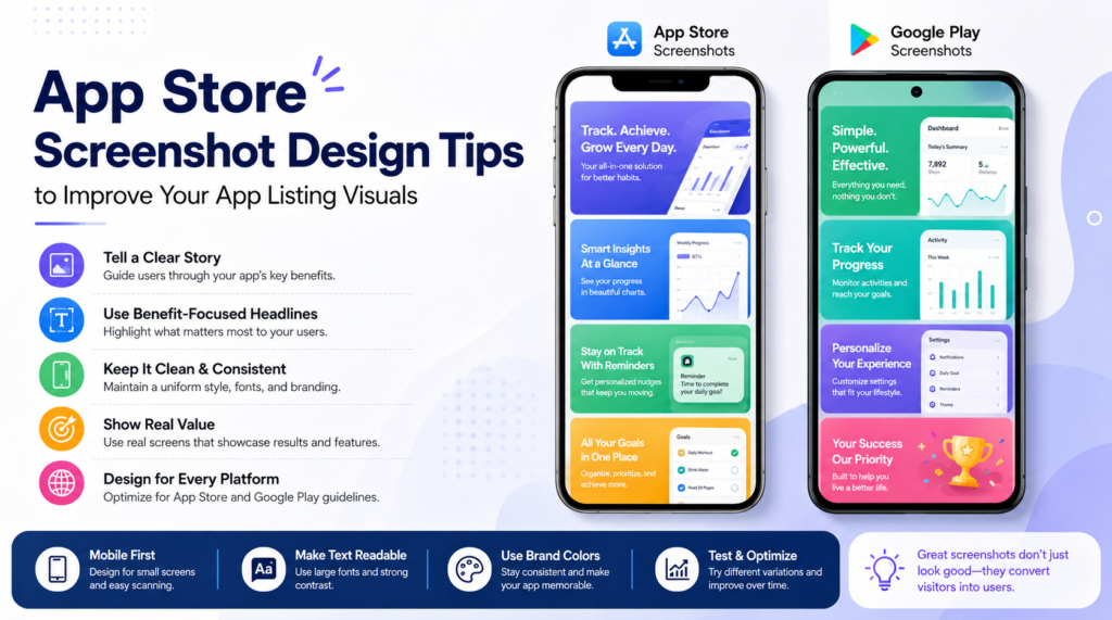
When people visit your app listing, they often decide within seconds whether your app feels useful, trustworthy, and worth downloading. Your icon may catch attention, and your title may explain what the app does, but your screenshots do the heavy lifting. They show the real experience, highlight key benefits, and help users imagine the value before they tap install.
That is why app screenshot design is not just about making something look attractive. It is about communication. Strong app store listing visuals guide visitors through your app’s best features in a simple, visual, and convincing way. Whether you are preparing App Store screenshots for iOS or Google Play screenshots for Android, the right design choices can improve how users understand your app and how confidently they choose it.
Start with a Clear Visual Story
The biggest mistake many app creators make is uploading random screen captures without a clear flow. A user should not feel like they are looking at disconnected images. Your screenshots should tell a short story from the first frame to the last.
Start by asking what the user needs to know first. Usually, the first screenshot should show the strongest benefit of the app. It should answer the question, “Why should I care?” The next screenshots can then support that promise by showing important features, ease of use, results, or unique tools.
A simple structure can look like this:
- Screenshot 1: Main benefit or strongest value
- Screenshot 2: Core feature
- Screenshot 3: How the app solves a problem
- Screenshot 4: Extra feature or personalization
- Screenshot 5: Trust, convenience, or final call to action
This structure keeps your mobile app screenshots focused. Instead of showing everything, you show what matters most.
Design for Fast Scanning
Most users do not carefully read every word on your listing. They scan. This means your app store screenshots should be easy to understand at a glance. Large text, clean spacing, and strong visual hierarchy are essential.
Avoid small captions that disappear on mobile screens. Your headline should be short, clear, and readable. Think of each screenshot as a mini advertisement for one feature. One screenshot should communicate one main idea.
For example, instead of writing, “Our app helps users track daily habits, monitor progress, and stay motivated with personalized reminders,” write something shorter like, “Build Better Habits Daily.” The screen below can show the habit tracker in action.
This approach makes your app screenshot design more direct and user-friendly.
Use Benefit-Focused Headlines
A feature tells users what your app has. A benefit tells them why it matters. Good app store listing visuals usually combine both, but the headline should lean toward the benefit.
For example:
- Feature-focused: “Advanced Budget Tracker”
- Benefit-focused: “Control Your Spending Easily”
The second version feels more useful because it speaks to the user’s goal. This is important because users do not download apps only for features. They download apps because they want a result, a solution, or a better experience.
When creating store-ready app screenshots, write headlines that connect with user needs. A fitness app might say, “Train Smarter at Home.” A Bible app might say, “Find Daily Inspiration.” A finance app might say, “Track Every Expense in Seconds.”
Keep the Design Clean and Consistent
Consistency builds trust. If every screenshot uses different fonts, colors, layouts, and icon styles, the listing can feel messy. A polished visual system makes your app look more professional before users even open it.
Use a consistent background style, font pairing, text placement, and device frame across all screenshots. You can vary the content, but the design language should feel connected.
A clean layout usually includes:
- A short headline
- A real app screen
- Enough empty space
- Brand colors used carefully
- Simple supporting elements
Do not overload screenshots with too many arrows, badges, icons, or decorative shapes. These elements can help when used lightly, but they can quickly make the design feel crowded.
Choose the Right Screens to Show
Not every screen inside your app deserves a place in your listing. You should choose screens that help users understand value quickly. A settings page may be useful inside the app, but it is rarely the best choice for promotional screenshots.
Focus on screens that show action, results, or transformation. If your app helps users learn, show progress. If it helps users shop, show product discovery or checkout ease. If it helps users manage tasks, show organization and completion.
The best App Store screenshots and Google Play screenshots are not just pretty. They are strategic. They make the user think, “This app looks like it can help me.”
Match Screenshots to Platform Expectations
App Store and Google Play users may behave similarly, but each platform has different layout expectations and technical requirements. This is why many app teams use an App Store screenshot generator or a Google Play screenshot generator to prepare platform-specific visuals.
An App Store screenshot generator can help you create sizes and layouts suitable for iPhone and iPad listings. A Google Play screenshot generator can help prepare visuals for Android phones, tablets, and other device formats. Using the right tool reduces manual resizing and helps maintain consistency across platforms.
A good app screenshot generator also saves time when you need to update designs after a feature launch, seasonal campaign, or branding change.
Make Text Readable on Small Screens
Your screenshots may look perfect on a desktop preview, but users will often see them on a small phone screen. Always test readability at actual mobile size.
Use strong contrast between text and background. Avoid placing text over busy app screens unless there is a clear overlay or background block. Keep headlines short enough that they do not wrap awkwardly.
A good rule is to view your screenshot at thumbnail size. If you can still understand the main message, the design is likely working. If the words feel cramped or the screen looks confusing, simplify it.
Readability is one of the most important parts of app screenshot design because even a beautiful design fails if users cannot understand it quickly.
Highlight What Makes Your App Different
Your competitors may offer similar features, so your screenshots need to show what makes your app special. This does not always mean showing a complex function. Sometimes, the difference is speed, simplicity, personalization, design quality, or a smoother user journey.
Ask yourself:
- What is the strongest reason users choose this app?
- Which feature solves the biggest pain point?
- What can we show visually that competitors do not show clearly?
- What result does the user want most?
Once you know the answer, make that difference visible in your app store listing visuals. Do not hide your best selling point in the fourth or fifth screenshot. Put it early, where users are most likely to see it.
Use Realistic App Screens
Your screenshots should look polished, but they should still feel honest. Users want to know what the actual app experience looks like. Over-designed visuals that hide the real interface can create doubt.
Use real screens from the app and enhance them with tasteful backgrounds, captions, and device frames. Do not show features that are not available. Do not exaggerate results. Trust matters, and misleading screenshots can hurt long-term performance.
Store-ready app screenshots should balance promotion with accuracy. They should make the app look appealing while still representing the real user experience.
Localize Screenshots for Different Audiences
If your app targets users in multiple countries, localization can make a major difference. Translating the app description is helpful, but localized screenshots can be even more powerful because visuals are often noticed first.
Localization is not only about language. It can include currency, date formats, cultural preferences, names, examples, and imagery. A finance app for US users may show dollars, while the same app for another region may need different formats.
Localized mobile app screenshots feel more familiar and relevant. They show users that the app is designed with them in mind.
Use Tools to Speed Up the Design Process
Designing screenshots manually can take a lot of time, especially if you need multiple device sizes and platform versions. This is where tools like AppScreens can help teams create professional visuals faster.
With AppScreens, app creators can choose layouts, add app screens, use device frames, write captions, and export store-ready screenshots without starting from scratch each time. A reliable app screenshot generator can help with layouts, device frames, background styles, and export sizes. This makes it easier to create store-ready app screenshots that look consistent across different listings.
Using an App Store screenshot generator or Google Play screenshot generator is especially useful for developers, marketers, and startup teams that need high-quality results without slowing down their launch process.
Test and Improve Over Time
Your first screenshot set does not have to be your final version forever. User behavior changes, competitors update their listings, and your app may add new features. Reviewing and improving your screenshots over time keeps your listing fresh.
Try testing different headline styles, feature order, background designs, and first screenshot messages. Sometimes a small change, such as making the main benefit clearer, can improve user response.
Pay attention to what users care about most. Reviews, support questions, and app analytics can reveal which features should be shown more clearly. Your screenshots should grow with your app.
Turn Better Visuals into More Confident Downloads
Strong app store listing visuals help users understand your app faster and trust it more easily. The goal is not to decorate your listing. The goal is to communicate value with clarity, style, and purpose.
When your screenshots tell a clear story, use readable text, show real benefits, and follow a consistent design system, your listing becomes more persuasive. Whether you create designs manually or use an app screenshot generator, the focus should always stay on the user’s decision-making journey.
Well-designed App Store screenshots and Google Play screenshots can make your app feel polished before it is even downloaded. With the right approach, your visuals can turn quick visitors into confident users.
Try AppScreens to create polished, store-ready screenshots for your next App Store or Google Play listing.