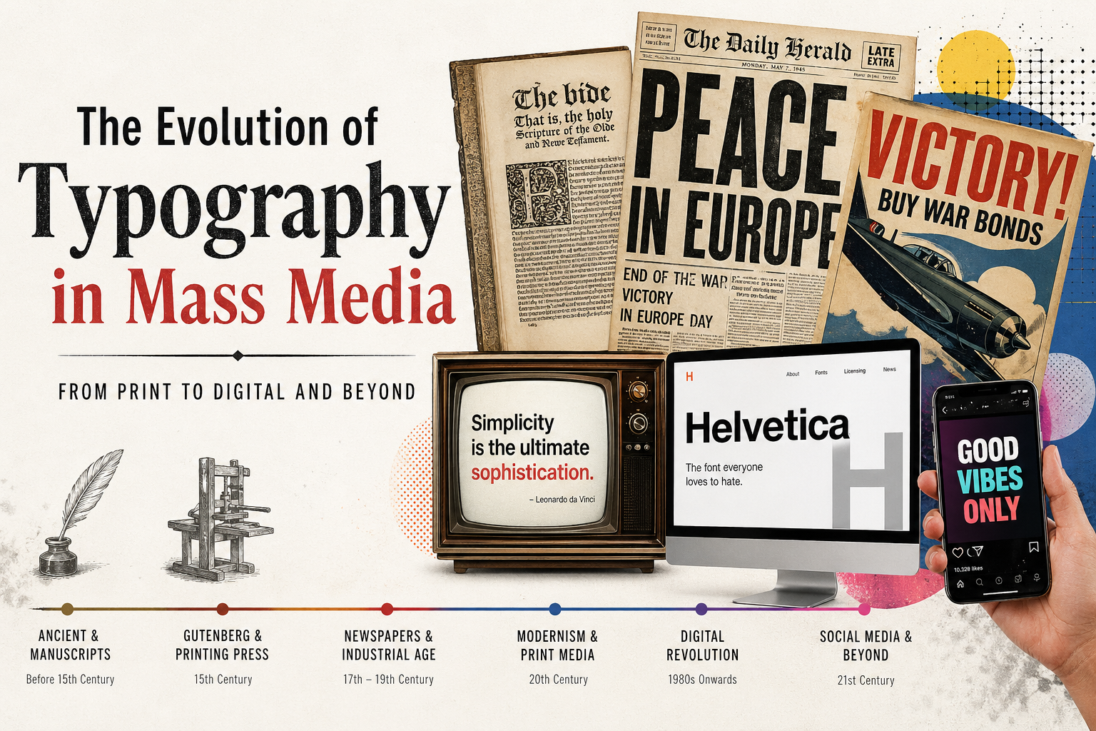
Typography has always been more than a composition of characters. It is a potent force in mass media, influencing the communication, comprehension, and retention of information. Typography has evolved from manuscripts to digital responsive designs, paralleling the development of media more broadly. The history of typography is intertwined with the evolution of technology, culture, and communication. The historical development of typography explains why typography is still a crucial element of newspapers, magazines, advertisements, television, and computer screens today.
Typography affects legibility, tone, and branding. Whether it’s a newspaper headline, billboard slogan, or tweet, type design is used to draw attention and convey information. With the evolution of mass media from print to broadcast and digital, typography has evolved to suit different media, audiences, and technologies. Its evolution has been shaped by the advent of the printing press, industrial processes, phototypesetting, desktop publishing, and the emergence of today’s web technologies. All have played a role in the typography we see today, making it one of the world’s most ever-evolving visual communication mediums.
Early Typography in Civilisation
Typography as we know it today was not established until writing became a more formalised system of handwritten scripts. Egyptian, Greek, and Roman scripts formed the basis of typography. Egyptian hieroglyphics provided a system of visual symbols, while Roman inscriptions created letterforms that influenced the development of modern letterforms. Roman capitals inscribed on monuments are often thought of as the earliest form of typographic design due to their uniformity, harmony, and proportion.
In the Middle Ages, manuscripts were copied by scribes in monasteries, and the letterforms they used were calligraphic and symbolised cultural and spiritual significance. Typography was both non-mechanical and artistic. Different regions had distinct letterforms, and books were produced slowly and at great cost. Manuscripts were only available to the affluent or churches. This made written communication elitist, and there was a need for quicker and more convenient ways of reproducing text. The need for the distribution of information led to one of the greatest communication revolutions.
Gutenberg and Modern Typography
The Printing Press Revolution
In the middle of the 15th century, Johannes Gutenberg invented movable type. Gutenberg’s press enabled individual metal type to be set into words, inked, and then reused on other pages. This technique greatly sped up the process of book-making and made books more affordable for the public. Type became more consistent and less individual, marking the start of mass-produced typography.
Gutenberg’s typefaces were based on Blackletter, which mimicked the handwritten style of the time in Europe. These typefaces were ornate and packed together, but they represented the first step towards uniformity in letterforms. The printing press played a key role in the dissemination of information, which led to social movements like the Renaissance and the Protestant Reformation. Type was used for educating and promoting religion and politics. Print communication was suddenly accessible to a large audience, paving the way for newspapers, books, and public literature.
The Rise of Serif Typefaces
Aldus Manutius and Readability
In the aftermath of Gutenberg, type design improved in terms of readability and aesthetics. Aldus Manutius brought Roman fonts modelled on Roman inscriptions. These serif typefaces had clearer strokes and spacing, enhancing legibility. Serif fonts soon became the norm for books and other publications due to their improved readability and balance.
Manutius’s invention of italic type added another typeface to the typographer’s arsenal. It could be used to emphasize text and to format smaller books. These innovations illustrated how typography was starting to play a functional, aesthetic, and editorial role in reading. Typography became an element of reading, affecting the reader’s experience.
Typography in Mass Media: The Newspaper Revolution
Typography and Information Hierarchy
Newspapers became a major medium of news in the 17th and 18th centuries. Type was vital in presenting information for public consumption. Titles, columns, and text needed to be distinguished hierarchically to communicate information. Newspapers used serif type because it was easier to read in long paragraphs and bold headlines to draw readers’ eyes to the big stories.
With growing popularity, typography became more formalised. Printers began to establish rules for text alignment, spacing, and composition. Typography was no longer confined to letterforms but concerned the whole page. The concept of hierarchy emerged, using size, weight, and spacing to create a hierarchy of information. Newspapers showed how typography could guide the viewer and influence perceptions of the news.
Typography and Political Influence
Typography was also used for political purposes in newspapers. Political newspapers and pamphlets of the French Revolution highlighted their headlines and used strong typographic effects to sway public consciousness. In the French Revolution, for example, typography was used to promote political ideas and incite revolution. The speed and efficiency of typography in reproducing persuasive text made it extremely powerful.
The Rise of Display Typography with the Industrial Revolution
Typography in Advertising and Public Spaces
The Industrial Revolution marked a shift in typography with the advent of mechanised printing and advertising. With the rise of commercial advertising, typography escaped its traditional confines of books and newspapers and found its way into posters, packaging, and billboards. As a result, display typefaces were developed to be large and attention-grabbing.
This was also the time when sans-serif fonts were developed, providing a cleaner and more contemporary look than serif fonts. These were very successful in advertising due to their readability. Typographic styles became more decorative, with exaggerated forms, different weights, and styles. The rise of industry led to more access to printed materials, and typography became a key element in consumerism.
Urbanisation also led to a demand for public signs. Type needed to be read from a distance and at a glance, affecting the design of public transportation, advertising, and storefronts. This era saw typography established as a means of both communication and marketing.
Modernism and Simplified Typography
The Bauhaus Influence
Modernist design principles were introduced in the early 20th century. Drawing inspiration from Bauhaus, typographers prioritised simplicity, efficiency, and legibility. Ornate fonts were replaced with geometric shapes, embodying the technological and industrial advances of the time.
Modernity was reflected in sans-serif typefaces. Typography embraced grid systems, alignment, and minimalism for effective communication. Magazines, ads, and branding embraced these typographic principles, resulting in more organised and unified visual communication. Modernist typography emphasised legibility and efficiency, setting global standards for graphic design.
The Influence of Helvetica
Helvetica’s design in 1957 was a significant event in typography. Helvetica’s neutral appearance and excellent legibility ensured its popularity in mass media. It became the go-to typeface for branding, transportation, and advertising. Helvetica embodied the notion that type could be invisible yet highly successful in its ability to communicate.
Phototypesetting and the End of Metal Type
A New Era of Flexibility
In the mid-20th century, metal type was replaced with phototypesetting. It involved the use of light and photographic techniques to typeset text, offering more control over font size, spacing, and other typographical options. It sped up the process of typography, making it more editable, and revolutionised publishing and advertising.
Phototypesetting allowed for greater creativity. This allowed designers to play with text in ways that were not possible with metal type and resulted in creative magazine covers and advertisements. Magazines and newspapers became more visually rich, with typography integrated with images and illustrations. This was the shift from mechanical to digital typography.
The impact of phototypesetting is evident in publications like Time and Vogue, where typography was used as a storytelling element.
The Digital Revolution with Desktop Publishing
Personal Computers and Design Freedom
Personal computers in the 1980s revolutionised typography. Software enabled typography to be designed on computers. Software such as Adobe Illustrator and Adobe InDesign allowed typography to be used outside of printing companies.
Such democratisation of design transformed mass media communications. Companies and individuals could create high-quality artwork without the need for heavy machinery. Typography became quicker, more agile, and more creative. Designers could explore various layouts, fonts, and hierarchies in real time.
Computer typography also broadened the range of fonts available, with thousands of fonts to choose from. This allowed designers to be more creative but also posed challenges in legibility and consistency. Digital typography made it possible for text to be a versatile design element for both print and digital media.
The Role of Apple and Microsoft
Apple and Microsoft made digital typography accessible with their multi-font, text-rendering operating systems. Their advances ensured typography became an integral element of digital communication.
Responsive Web Typography
Typography for the Internet Age
With the advent of the internet, typography faced new challenges. Computer screens were of different sizes, resolutions, and interactive. In the beginning, only system fonts could be used, limiting design options. But improvements in web fonts led to a revolution.
Google Fonts and embedded fonts in CSS enabled designers to use custom fonts on the web, opening up new design options. Responsive typography was born, adapting to various screen sizes and devices. This adaptability was necessary for the shift to mobile media through tablets and smartphones.
Readability, accessibility, and fast load times are key considerations in web typography. Spacing, contrast, size, and hierarchy are fine-tuned for optimal user experience. Typography for digital media needs to be flexible, with multiple contexts to cater for.
Typography as Branding in Social Media
Typography and Brand Identity
Typography became a real-time, highly visual medium through social media. Social media platforms such as Instagram, X, and TikTok use typography for branding, messages, and advertisements. In these spaces, typography needs to immediately grab attention, often within a few seconds.
Typography helps brands build identities. Typefaces convey traits like trust, elegance, or fun. Current social media trends include the use of bold sans-serif fonts, large text, and animated typography to captivate audiences. Fonts are now integral to brand communication, requiring consistency in the crowded online environment.
The fast pace of social media means typography must be succinct and punchy. Appropriate typeface and typography can influence user engagement and retention.
Typography in the Age of Accessibility
Inclusive Design in Typography
Accessibility is a growing influence on typography. Readability for the visually impaired, dyslexic individuals, and those with other reading difficulties is taken into account. Accessible typography involves contrast, legible font sizes, and spacing.
Websites and apps adhere to accessibility standards for inclusive design. Typography is now both an aesthetic and ethical consideration. This is part of a recognition of communication as a human right. Major media companies focus on accessible typography to engage more viewers and enhance user experience.
Typefaces and principles designed for accessibility are now impacting mainstream typography and demonstrate that good design can be beautiful.
The Future of Typography in Mass Communication
Emerging Technologies and Typography
Typography is constantly changing with new technologies. Augmented reality, virtual reality, and artificial intelligence are ushering in new typographic spaces for immersive user experiences. Kinetic typography is increasingly being used in video, advertisements, and interactive media.
One recent advancement is variable fonts. These fonts can dynamically change weight, width, and other attributes while offering better performance. They are particularly valuable for responsive design and branding.
We can expect the future of typography to be more personalised, interactive, and responsive. With the increasing fragmentation of communication channels, typography will continue to be a crucial element in the design of information. Its function in mass media is dynamic; it is reinventing itself with every new medium.
Conclusion
Typography in mass media mirrors the history of communication. From the manuscripts of ancient scribes to Gutenberg’s printing press, digital displays, and responsive web design, typography has evolved to suit the tools and technologies of the time. Each phase has brought with it new opportunities for legibility, visual structure, and interaction.
Typography continues to be a critical component of mass media communication as it not only affects what is being communicated, but also how it is received and understood. Its evolution from print to digital media shows its capacity for adaptation while fulfilling its function of facilitating clear, effective, and meaningful communication. In an ever-evolving technological landscape, typography will continue to play a pivotal role in communication.