You spent $500 on ads last week. Your click-through rate was great, but only 2% of visitors bought something. Sound familiar? You’re not alone. Many businesses struggle with this exact problem. They get people to click their ads, but something goes wrong between that first click and the final sale.
The missing piece is often web design. Your website design plays a huge role in guiding visitors from curious browsers to paying customers. When your design works well with your marketing funnel, you’ll see more sales from the same ad spend. Let’s explore how great web design can transform your marketing results.
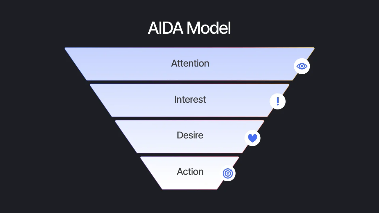
What is a marketing funnel and why does design matter?
A marketing funnel shows the path your customers take from first hearing about you to making a purchase. Think of it like a real funnel. At the top, lots of people discover your brand through ads or social media. As they move down the funnel, some drop off at each stage. The goal is to keep as many people as possible moving toward a purchase.
The funnel has three main stages. First is awareness, where people learn about your business. Next is consideration, where they compare you to competitors and learn more. Finally comes the decision stage, where they choose to buy or not.
Web design affects every single stage. Poor design makes people leave before they understand what you offer. Good design keeps them engaged and guides them naturally toward buying. Your design is like a helpful salesperson who knows exactly what to show visitors at the right time.
The first impression: Landing page design sets the tone
When someone clicks your ad, they land on your website with high expectations. You have about 3 seconds to make a good first impression. If your landing page looks outdated or confusing, visitors will hit the back button faster than you can say “conversion rate.”
Mobile responsiveness is non-negotiable
More than half of all website traffic comes from mobile phones. If your site doesn’t work well on phones, you’re losing customers before they even see what you sell. A mobile-friendly design adjusts to any screen size and makes buttons easy to tap with fingers.
Load speed affects bounce rates
Slow websites kill conversions. If your page takes more than 3 seconds to load, 40% of visitors will leave. Fast loading times keep people engaged and show them you care about their experience.
Visual hierarchy guides visitor attention
Good design uses size, color, and placement to show visitors what’s most important. Your main headline should be the biggest text on the page. Your call-to-action button should stand out with a bright color. When you organize information clearly, visitors can quickly understand your offer.
Whether you’re working with a local Web Design Sydney team or handling it in-house, your landing page design needs to match the promise made in your ad. If your ad talks about “premium quality,” your design better look premium too.
Building trust through professional design
Trust is everything in online business. People won’t buy from websites that look sketchy or unprofessional. Your design is often the first thing that tells visitors whether they can trust you with their money.
Clean, modern design makes your business look established and reliable. This doesn’t mean boring. It means using plenty of white space, readable fonts, and professional photos. Avoid cluttered layouts with too many colors or fonts competing for attention.
Consistent branding across your entire funnel builds recognition and trust. Your logo, colors, and fonts should look the same on your ads, landing pages, and checkout process. When everything matches, visitors feel more confident they’re dealing with a real business.
Don’t forget about social proof and testimonials. Customer reviews, case studies, and trust badges should be placed where visitors can easily see them. These elements work with your design to build credibility and reduce purchase anxiety.
Optimizing the middle of your funnel
Once visitors get past your landing page, they enter the consideration stage. Here, they’re exploring your products or services and comparing options. Your design needs to make this process smooth and informative.
Clear navigation keeps visitors engaged
Confusing navigation is a conversion killer. Your menu should be simple and logical. Use clear labels that tell visitors exactly where each link leads. A good rule is that visitors should be able to find any important page in three clicks or less.
Strategic content layout reduces confusion
Information architecture matters. Put your most important content above the fold where visitors see it immediately. Use headings and bullet points to break up long blocks of text. Group related information together so visitors can scan quickly and find what they need.
User experience design principles help create a natural flow through your content. Each page should have one clear purpose and guide visitors to the next logical step. Remove any elements that distract from your main goals.
Converting visitors at the bottom of the funnel
The bottom of your funnel is where the magic happens. This is where interested visitors become paying customers. Your design choices here directly impact your conversion rate and revenue.
Compelling call-to-action buttons
Your call-to-action buttons are mini salespeople. They need to stand out visually and use action words that motivate clicks. “Buy Now” works better than “Submit.” “Get Started” feels less scary than “Purchase.” Test different button colors, sizes, and text to see what works best for your audience.
Simplified checkout and form design
Every extra form field you add reduces conversions. Only ask for information you absolutely need. Make the checkout process as simple as possible. Show progress indicators so people know how many steps remain. Offer guest checkout options so people don’t have to create accounts.
Trust signals and security features become extra important at checkout. Display security badges, accepted payment methods, and money-back guarantees prominently. These visual elements help overcome last-minute purchase hesitation.
Measuring and improving your design’s impact
Good web design isn’t a set-it-and-forget-it solution. You need to track how your design performs and make improvements over time.
Key metrics include bounce rate, time on page, and conversion rate. If lots of people leave your landing page quickly, your design might not be clear enough. If people stay but don’t convert, you might need stronger calls-to-action or better trust signals.
A/B testing lets you compare different design versions to see which converts better. Test one element at a time, like button color or headline text. Small changes can lead to big improvements in your conversion rates.
Conclusion
Great web design is the bridge between your marketing efforts and your sales results. It guides visitors through your funnel, builds trust at every step, and removes barriers to purchase. When your design works in harmony with your marketing strategy, you’ll see more sales from the same advertising budget.
Take a honest look at your current website. Does it support your marketing funnel, or does it create roadblocks? The investment in professional web design pays for itself through better conversion rates and happier customers.