You know that feeling when you finally nail a typeface? It’s got the right personality. Reads
clean at 12px and gorgeous at 72. Pairs with your secondary font like they grew up together.
You buy the license. Download the files. Start building.
And then everything falls apart.
The font won’t load in your prototyping tool. Your developer says the format isn’t web-
compatible. The print vendor needs something else entirely. The client’s marketing team uses
Canva and can’t install desktop fonts. The app developer wants a stripped-down version that
won’t balloon the mobile build.
That perfect typeface just became a logistics nightmare. And here’s what gets me. Most
designers treat this like weather. Just something you endure. It’s not. Every single one of these
problems is fixable.
This is a breakdown of the real font compatibility headaches designers hit across web, print,
product, mobile, and branding work. More importantly, it’s how to fix each one without gutting
your design.
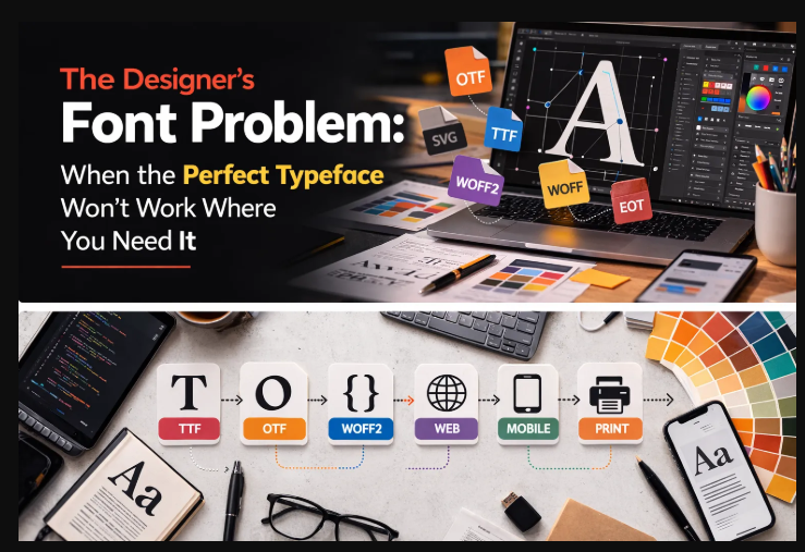
One Typeface, Way Too Many Formats
Fonts aren’t like JPEGs. A JPEG opens anywhere. Font files? They come in a half-dozen
formats built for different decades, different platforms, different purposes. It’s like showing up to
a potluck where everyone was told a different theme.
TrueType (.ttf) came out of Apple and Microsoft in the late 1980s as a counter to Adobe’s
PostScript fonts. It became the default desktop format and still ships with most operating
systems. TrueType handles screen rendering and basic print work fine, but carries zero
compression. For digital use, the files are bigger than they need to be.
OpenType (.otf) grew out of TrueType through a Microsoft-Adobe collaboration. This is where
things get interesting for designers. Ligatures, stylistic alternates, small caps, swashes,
contextual substitutions. All that typographic control lives inside OpenType. Most professional
foundries distribute in this format.
WOFF and WOFF2 (.woff, .woff2) are web-only wrappers. They compress TrueType or
OpenType data for faster loading over networks. WOFF2 uses Brotli compression and produces
the smallest files. But try opening one in Illustrator. It won’t work. These exist exclusively for
browsers.
EOT (.eot) is a relic. Microsoft made it for Internet Explorer. You’ll occasionally find it haunting
older codebases like a ghost that won’t leave. No modern relevance whatsoever.
SVG fonts turn glyph outlines into vector paths. Rarely a primary format anymore, but they still
show up in specific situations like icon fonts and animated type.
The core problem is brutally simple. No single format works everywhere. A designer bouncing
between web, mobile, print, and brand collateral needs to speak all of these formats fluently.
That’s where workflows collapse.
The Design-to-Dev Handoff Bottleneck
This one drives me up the wall because it happens on almost every project.
A designer builds a website layout in Figma or Sketch using an OpenType font. Beautiful
ligatures. Carefully chosen stylistic alternates. The client approves. Off it goes to development.
The developer gets .otf files. They need .woff2. They find some command-line tool they’ve
never touched, spend half an hour fighting installation errors, and eventually spit out a
converted file that may or may not keep the OpenType features the designer actually relied on.
Designer gets the staging link. The ligatures are gone. Letter spacing looks off. The font weight
renders heavier than it did in Figma. Now there’s a three-day back-and-forth that delays launch.
Here’s the thing though. This is entirely preventable.
Before handoff, the designer should convert font format to web-ready WOFF2 and include the
converted files in the asset package. That’s it. That one step eliminates an entire category of
friction.
A clean font handoff package looks like this:
● Original .otf or .ttf source files for reference
● Pre-converted .woff2 and .woff files, production-ready
● A short note listing which OpenType features the design depends on (specific ligatures,
alternates, whatever matters)
● The exact font-family naming convention from the design file
When the designer owns that conversion step, they can verify the output matches their intent
before a developer ever sees it. It’s five minutes of work that saves days of debugging.
Brand Consistency When Everyone’s Using Different
Tools
Branding projects are where font logistics get genuinely chaotic.
Think about it. A single brand typeface needs to work on the website (WOFF2), the mobile app
(maybe TTF or a custom subset), social media graphics built in Canva (which only handles
certain formats), pitch decks in PowerPoint and Google Slides (each with their own quirks),
email templates, signage, packaging, and whatever internal documents the client’s team
produces.
That’s a lot of surfaces. And what usually happens is someone on the team converts the font for
one use case, someone else converts it differently for another, and within six months there’s a
messy folder of format variations created at different times with inconsistent settings. Nobody
remembers which version is current.
The fix isn’t complicated, but it does require doing the work upfront. During the brand identity
phase, build a structured font kit. Start from the foundry’s original source files. Generate everyformat variation the brand will need from that single source. Organize by use case (web,
desktop, mobile, print) with clear naming and usage guidelines.
This isn’t fussiness. It’s a brand consistency safeguard. When everyone across the organization
pulls from the same managed kit, you kill the subtle rendering differences that accumulate when
people convert fonts independently with different tools and different settings.
Multilingual Projects and the Character Set Trap
Designing for one language is managable. Designing for ten? That’s where font selection gets
treacherous in ways that surprise even experienced designers.
Not every typeface supports every script. Your brand font might look incredible in English but
completely lack Cyrillic characters for the Russian market. No Arabic glyphs for Middle Eastern
audiences. No Devanagari for Hindi. You discover this deep into the project when a translated
layout suddenly renders in Arial because the system font had to step in. Your design is cooked.
And even when a typeface does cover multiple scripts, the full character set turns the font file
into a beast. A comprehensive multilingual font can blow past 1MB per weight. Loading all that
data for someone who reads one language is wasteful.
The answer is font subsetting. Creating tailored versions for each language or region. A font
subsetter lets you extract only the character ranges needed and produce separate lightweight
files.
For a site serving English, German, and French users, you’d create one subset covering Basic
Latin and Western European characters (U+0020–007F, U+00A0–00FF, U+0100–017F).
Japanese audience gets a separate subset with CJK characters. Each user downloads only the
glyphs relevant to their language.
Same principle applies to mobile apps, where every kilobyte of asset size affects download time
and app store ratings. Subsetting lets you ship a branded typeface without the penalty of
carrying 8,000 glyphs when the app only displays 300.
Email Design: Where Fonts Go to Die
Actually, let me rephrase that. Email is where font ambitions go to die.
Most email clients, including Outlook, Gmail, and Yahoo Mail, just strip your custom font
declarations entirely. That @font-face rule you wrote? Gone. Your audience sees Arial. Or
Helvetica. Or Times New Roman. Whatever the system decides.
A few clients do support web fonts. Apple Mail, iOS Mail, some Thunderbird versions. If a
meaningful chunk of your audience uses these clients, embedding a custom font genuinely
elevates the design above the inbox noise.
But the files need to be tiny. Email preheaders, images, and HTML structure are already
pushing message size limits. Drop a 300KB font file on top of that and you risk Gmail clipping
the email (it truncates anything over 102KB of HTML) or killing mobile load times.
This is where subsetting and format conversion work together. Subset the font to only the
characters the email actually uses, usually just upper and lowercase Latin, numerals, and basic
punctuation. Convert to WOFF2 for clients that support it, WOFF as fallback. You end up with a
font file under 15KB. Brand typography where it’s supported. Graceful degradation everywhere
else.
Variable Fonts: Powerful But Not Always Practical
Variable fonts are the biggest typography shift since we moved from print to screen. Instead of
separate files for each weight, width, and style, one variable font file contains an entire design
space adjustable along continuous axes.
One file replacing six, eight, twelve static files. Regular, medium, semibold, bold, light, extra
bold, plus italics. For design systems and component libraries, this is a genuine leap forward.
One file provides every weight and style the product needs.
But. There’s a catch.
The full variable font file is typically larger than any single static weight. It carries interpolation
data for the whole design space. A variable font replacing twelve static files might weigh 400KB.
That’s smaller than all twelve combined, sure, but considerably larger than the two or three
weights most pages actually load.
For projects using only a few specific weights, the smarter move is extracting those weights as
static instances, then converting to WOFF2 for production. You get exactly what your design
needs without hauling the entire design space along.
For projects that genuinely use the full weight range (design tools, text editors, customizable
themes) serving the complete variable font makes sense. Convert to WOFF2, subset to the
required character ranges, and the combination of glyph removal and Brotli compression usually
brings it down to a reasonable size.
Icon Fonts vs. SVG: It’s Not As Settled As People Think
Icon fonts were the standard for scalable UI icons for years. Font Awesome, Material Icons,
custom sets. Hundreds of icons packed into a single font file, each mapped to a Unicode
character. Perfect scaling. CSS styling with color and size. One HTTP request.
The industry’s mostly shifted to inline SVG for good reasons: better accessibility, multicolor
support, more predictable rendering. But icon fonts haven’t entirely lost their use cases. Legacy
systems. Email templates where inline SVG gets stripped. Environments with hard CSS-only
styling requirements.
The problem with icon fonts mirrors the problem with text fonts. Most packages include
hundreds of icons. Your project uses twenty. Font Awesome’s full package exceeds 200KB. If
you need a search icon, a hamburger menu, and three social logos, you’re shipping 195KB of
dead weight.
Subsetting fixes this cleanly. Pull out only the glyphs your project needs, convert to WOFF2,
and deploy a custom icon font at 5–10KB instead of 200. For projects committed to the icon font
approach, this optimization is the difference between lean and bloated.
Crossing the Print-Digital Divide
Designers rarely live in one medium. You’re doing print one week, digital the next, often both
simultaneously. And each side has font requirements that create friction when you cross over.
A brand identity built for print (business cards, brochures, packaging) typically runs on
OpenType fonts with advanced features like optical sizing, contextual alternates, discretionary
ligatures. InDesign and Illustrator handle all of it beautifully.
Extend that same identity to a website or app? Those OpenType features might or might not
survive. It depends on the browser, the CSS implementation, and how the conversion was
handled. Sloppy conversions drop ligature tables, lose kerning data, or break the hinting that
governs how characters look at small screen sizes.
Going the other direction creates different headaches. If the brand started as web-first using
Google Fonts, the designer might only have WOFF2 files. Print workflows need desktop-
installable TTF or OTF with complete glyph sets and proper embedding permissions.
A reliable conversion workflow between formats prevents these gaps. Web to desktop for print.
Desktop to web for digital. The key is always starting from the highest-quality source file and
converting outward to each format you need.
A Font Workflow That Actually Scales
Whether you’re freelancing solo or running a ten-person creative team, standardizing this stuff
saves real time.
During design pick typefaces with format availability in mind. What does the foundry provide?
Does the character set cover your target languages? Does the license allow the conversions
you’ll need?
During build generate all format variations from one master source. The order matters: subset
first to strip unnecessary glyphs, then convert to target format. That sequence maximizes
compression. And test across actual target environments, not just your machine.
During handoff deliver a complete font package organized by platform and use case.
Conversion notes. Character set documentation. CSS snippets ready for copy-paste. Five
minutes of organizing saves hours of developer confusion.
During maintenance keep your master source files archived. When requirements change, go
back to the master. New language on the website? Create a new subset from the master,
convert, deploy. Launching a mobile app? Generate a TTF subset from the same master. The
source file is the single point of truth.
Stop Treating Font Logistics Like an Afterthought
Typography problems in design projects almost never come down to picking the wrong
typeface. They come from the invisible stuff. Format incompatibility, bloated files, missing
characters, broken rendering across platforms. These are what turn a solid type decision into a
production migrane.
And the tools to solve every one of these problems exist. They take minutes, not hours. Convert
formats for cross-platform compatibility. Subset characters for performance. Build these steps
into your standard workflow instead of scrambling to fix things after the fact.
Your design decisions deserve to render exactly as you intended. On every platform. For every
user. Font management is what makes that possible.