In the ever-evolving digital landscape, dark Mode has emerged as an important user interface (UI) design player. Dark UI design, also known as Lights Out Mode or Dark Mode, is a user interface with a colour scheme resembling a negative photograph. There is a strong emphasis on the light foreground and dark background colours. It frequently entails using light text colours on a dark or black background.
Dark Mode isn’t just for giving your eyes a break from the glaring white light of the screen; it’s also an essential tool in modern UI design. Dark Mode contributes significantly to the overall user experience by considering eye strain, battery conservation, and user preference.
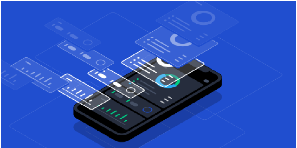
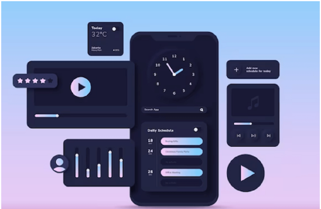
Dark Mode entails presenting content in a dark setting rather than the typical bright backdrop. This is also visible in various apps, web pages, and operating systems and is becoming increasingly popular due to its beauty and benefits. Dark Mode is a web design Denver choice that darkens the traditional bright backgrounds of digital interfaces.This article will explore the Significance, Benefits, and Design Principles of Dark Mode UI.
Importance of Dark Mode UI Design: In essence, dark Mode is a user interface (UI) design feature that replaces typical bright, light backgrounds with dark or black backgrounds. The primary goal of Dark Mode is to provide users with an alternative visual experience.
According to various reports, 60-80% (approx.) of people prefer dark mode design on their devices. With that massive amount of data, you must design your application so users can toggle between dark and light modes.
Benefits of Dark Mode UI Design:
1. Reduced eye strain:
Dark UI reduces eye strain when accessing a website or app in low-light conditions. Excessive light on the screen requires a great deal of attention and concentration, which can harm your eyes if you use a device for an extended period. In contrast, dark mode UI design reduces the lighting effect and ensures a comfortable viewing experience.
2. Aesthetic Appeal and Personalization:
Dark Mode in UI web design Denver has grown in popularity due to its association with a sleek and contemporary aesthetic. The elegant and sophisticated appearance of dark-themed interfaces appeals to many users. Furthermore, dark Mode adds a sense of customization and personalization to the digital experience, allowing users to tailor their digital experience to their personal preferences.Dark Mode improves overall user satisfaction and engagement by enabling users to customize their visual style.
3. Create a visual hierarchy and focus:
A dark user interface complements the visual hierarchical standout. It makes light-coloured text and content stand out and be easily visible against a dark background. As a result, users can stay focused and concentrate on the screen without strain.
4. Improved battery life (for OLED screens):
Dark Mode in UI design has a significant advantage for devices with OLED screens, as it can significantly increase battery life. OLED displays individually illuminate each pixel, and using dark backgrounds necessitates activating fewer pixels, resulting in improved battery efficiency and lower power consumption.
5. Emphasize the content better:
Designing a dark theme user interface helps to minimize content distractions, reduce light-shaded visual noise, and direct customers’ attention. In a way, the content visible on the dark screen takes centre stage and improves readability.
Principle of Dark Mode UI Design:
1. Focus on typography:
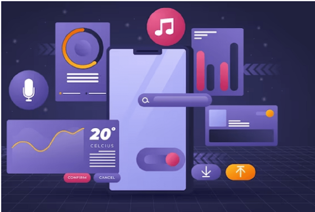
Typography adds the necessary style to the words, matching the dark user interface for an optimal user experience. A dark theme should complement the text well compared to a light UI. Every content must be visible in the background so that users can read and comprehend it thoroughly. One can also use light UI as it uses bright backgrounds, typically white or light gray, paired with darker text and minimalist elements. It emphasizes clarity, cleanliness, and simplicity, often creating a more open and less visually dense user experience.
2. Negative space:
The negative space is used wisely in UI design. A negative space is simply a space on a layout designed in light or dark Mode. No visible objects in the negative space are intended to provide some breathing space.
A crucial aspect of dark UI web design Denver is using minimalistic visuals and more text to draw the required attention. Negative space must be required simultaneously to make them more readable and encourage users to stay for a while. Furthermore, the proper balance of visual elements, text, and blank space should be achieved.
3. Colour:
Colour stands out in dark UIs. It is best to use schemes with lighter, unsaturated accent colours. Avoid using saturated colours in dark UIs because they can visually vibrate against dark surfaces. Furthermore, colours must meet the WCAG’s AA standard of at least 4.5:1 when used with text.
Google suggests using a limited number of colour accents when designing a dark UI colour scheme to keep most of the space available for dark surfaces.Using split complementary colours can help.
The scheme has one dominant colour and two colours adjacent to the complement of the dominant colour. This provides the necessary contrast while avoiding the tension of the complementary colour scheme.
4. Work on the Elevation:
As a professional web design practice, Elevation is all about adding depth to your content in the dark UI. Depth emphasizes the interface’s visual hierarchy and allows users to see things clearly and seamlessly.
Using lighting effects or shadows to add depth to a light-themed website is as simple as it gets. It takes time and effort to maintain a dark theme user interface. There is still space in the text for three to four levels of Elevation to make things more visible.
5. Use saturated colours on dark themes:
Saturated colours look good on light backgrounds but have a low readability factor on dark backgrounds. Because lighter tones have a higher readability factor, it is always recommended to use them for text.
Conclusion:
Finally, dark mode standardization paves the way for a more consistent, user-friendly, and accessible digital landscape. As it becomes the norm, we can look forward to reaping its many benefits across all our devices and digital experiences.
SoftCircles is a leading Denver web design agency provider of full-service branding solutions, including web design and logo design. Their expert team combines creativity and technical expertise to create eye-catching logos and websites.