How Small Tweaks and Bold Choices Can Turn Ordinary Pouches Into Shelf Superstars
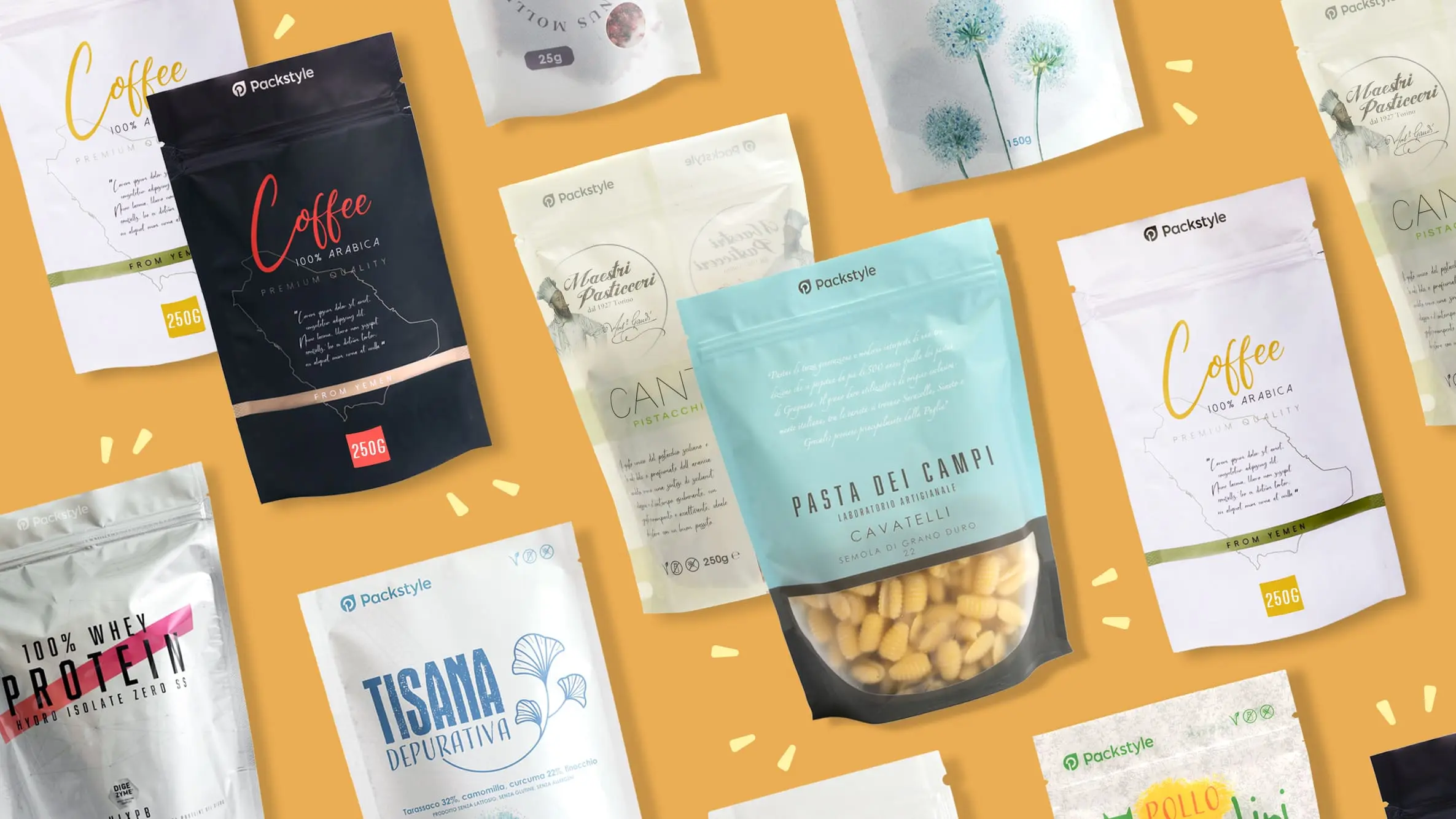
Walk down any aisle in a modern store and you’ll notice a quiet revolution happening on the shelves: stand-up pouches (aka doypacks) are everywhere.
From snacks to skincare, coffee beans to vitamins—these flexible packaging wonders have become the go-to for brands aiming to combine functionality, visual impact, and affordability.
But here’s the challenge: with so many brands using the same format, how do you stand out?
This article is your creative blueprint. Whether you’re a small business, indie brand, or a design-savvy entrepreneur, here’s how to transform your standard doypack from meh to marvelous.
What Makes the Doypack So Popular?
Before we dive into creative upgrades, it’s worth recognizing why the Doypack format is dominating packaging design:
- Self-standing shape gives natural visibility on shelves, great for various flavors of loose, perishable products (think custom spice doypacks)
- Compact, lightweight, and resealable (usually with a zipper)
- Ideal for both food and non-food products
- Works with both roll stock and pre-made pouch production
- Offers plenty of surface area for custom design and storytelling
In other words, it’s the little flexible pouch that could. Now let’s explore how to make it unforgettable.
1. Rethink the Finish: Texture Adds Depth
Go beyond gloss and matte
Changing the tactile quality of your pouch can dramatically affect how it’s perceived. Think of finish as your first non-verbal brand impression.
Premium Finishes to Consider:
- Soft-touch matte: Adds a luxurious feel and velvety texture
- Metallic foils: Elevate logos or accents with a shimmer that catches the light
- Spot UV gloss: Makes specific design elements pop against matte backgrounds
- Textured lamination: Think kraft-paper vibes or linen-style surfaces
Pro tip: Combining finishes on a single pouch (e.g., matte with foil logo) creates instant visual hierarchy.
2. Use Shape Strategically
Most Doypacks follow a familiar silhouette—but you’re not limited to the basics.
Custom die-cuts and edges can enhance brand personality:
- A wavy or scalloped top edge for artisanal or kid-friendly brands
- Rounded corners for a softer, more modern aesthetic
- Window cutouts in playful shapes (hearts, leaves, fruit outlines)
If you’re not ready for a full shape redesign, a unique spout placement or zipper style can still set you apart.
3. Design With Visual Layers
The best Doypack designs don’t just look good—they tell a story at a glance. Think in layers:
Start with this structure:
- Layer 1: Brand recognition (logo, name, and core color scheme)
- Layer 2: Product storytelling (ingredients, use case, flavor, benefits)
- Layer 3: Visual mood (illustrations, icons, photography, textures)
Creative Approaches:
- Use hand-drawn elements to evoke a small-batch or organic feel
- Integrate transparent windows into illustrations (e.g., a fruit with the pouch contents visible inside)
- Play with asymmetrical layouts to break away from the norm
Remember: flat pouches don’t mean flat design. Add depth with intentional color blocking, layering graphics, and strategic whitespace.
4. Add Interactive or Functional Features
Elevated design doesn’t stop at how a pouch looks—it’s also how it feels and functions.
Creative add-ons:
- Hang holes: Great for impulse-buy displays or vertical shelving
- Tear notches: Add convenience and user-friendly appeal
- Transparent measurement lines (especially great for protein powders or supplements)
- QR codes leading to behind-the-scenes content, loyalty programs, or product demos
If your customer uses the pouch every day, a reseal experience that’s smooth and reliable becomes a brand trust builder.
5. Color Psychology Still Wins
Your color palette might be the most powerful visual cue you have. When choosing colors for your pouch:
- Pastels evoke softness, calm, and wellness (popular in skincare and self-care)
- Neutrals + bold accents suggest sophistication with a creative edge
- High-contrast, high-saturation colors attract attention on crowded shelves
Don’t be afraid to:
- Use non-traditional colors for your category (e.g., a charcoal pouch for granola)
- Create limited-edition color drops to drive excitement and collectability. Think seasonal pet treat flavors in custom treat bags.
- Consider how your colors translate in both print and on-screen (for e-commerce)
Important: Always test color proofing with your printer—digital screens can lie.
6. Let Typography Lead
Typography is your brand voice, in visual form. Don’t settle for just legible—go for memorable.
Typography moves that elevate a Doypack:
- Use large, bold type for key product names or benefits
- Pair serif with sans serif for modern elegance
- Let typography interact with other elements (wrapping around illustrations, following curves, etc.)
- Avoid generic fonts—choose ones with personality
7. Think in Product Lines, Not One-Offs
If you’re offering multiple flavors, scents, or product variants, plan your Doypack design system holistically.
A few ways to create a cohesive yet distinctive range:
- Unified layout with unique accent colors for each SKU
- Numbering system (e.g., 01, 02, 03) for easy differentiation
- Color-coded side gussets or zippers
- Changing illustrations that “tell a story” when displayed together
When executed well, this kind of modular branding makes your shelf presence feel curated and intentional. This is great for a family of products, such as for end gondolas for custom herb bags.
Bonus: Keep It Retail-Ready
Design alone won’t sell a product—usability matters too. Make sure your elevated pouch also checks these boxes:
- ✅ Barcode in a scannable, accessible spot
- ✅ All legal and nutritional info included (for food)
- ✅ Plenty of contrast and clarity for digital thumbnails
- ✅ Shelf-stable materials matched to your product needs
Packaging that’s both beautiful and functional builds brand loyalty from the first interaction.
Final Thoughts: Small Details, Big Impact
Upgrading your Doypack design doesn’t require a massive budget—it just takes strategic thinking and bold creativity.
Remember, your packaging isn’t just a container. It’s:
- A visual elevator pitch
- A tactile brand experience
- A piece of shelf art
- A conversation starter
And when you go from flat to fabulous, your pouch becomes more than packaging—it becomes a brand ambassador in every aisle.