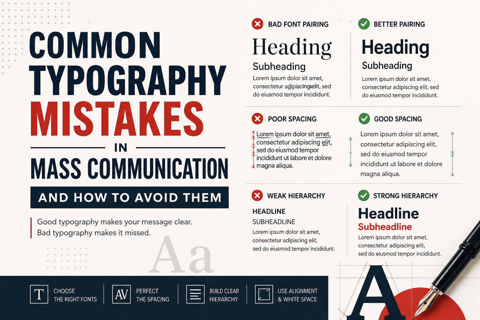
In the fast-paced world of mass communication, how information is presented is key. Typography is the silent language of communication, affecting how your readers perceive, comprehend, and remember your information. From newsletters to advertisements and even the reports of a multinational company, how you arrange type impacts whether your communication is read, understood, and remembered, or ignored, misunderstood, and forgotten.
Typography is not only about making something “look pretty,” but it is about improving readability and establishing a hierarchy of information, so the reader can “find their way.” And if we don’t consider the principles of type design, we lose information, we are overwhelmed by it, and the author loses credibility. A first impression is everything in matters of professionalism, and nothing is more “amateur” than a design that challenges the principles of type design.
Understanding Common Typography Mistakes in Mass Communication
The most common problem that designers face is a collection of typographic errors that reduces the effectiveness of the document. These mistakes can often be attributed to a lack of knowledge of the principles of type design and the physics of reading. For instance, failing to take account of the medium, such as using a fine serif typeface for a low-resolution digital billboard, can make the text incomprehensible to the reader.
Acknowledging and avoiding common typography mistakes in the initial design process will help the communicator to make sure the message is the focal point. Understanding the difference between error and failure in the design process will assist in achieving a level of professional mass communication that will appeal to many people. This is achieved by looking beyond the menu of fonts and the interaction between the reader and the letterforms.
1. The Problem with Bad Font Pairings and Overuse
The art of font pairing is a highly skilled task requiring a good knowledge of the visual impact, historical context, and stylistic harmony of a font. A common mistake in mass communication is the “clashing duo”, where the fonts used are not similar enough to be different, but too similar to “clash.” This occurs when pairing two similar sans-serif fonts (such as Arial and Helvetica) and can create a “vibration” or “uncanny valley” effect, which can distract the reader and serve no particular purpose.
Conversely, using too many fonts, also referred to as “font overkill”, can make the design clogged and unappealing, thus hiding the brand identity. Typically, a professional typeface should have two or three fonts. This forces the designer to use a combination of weight (bold, light) or style (italic) with each other to create contrast rather than overloading the design with a plethora of different and unrelated styles, which compete for the attention of the reader.
Key Points to Avoid Font Pairing Errors
- No “Clashing Duo”: Avoid using two fonts from the same family (e.g., two serifs) except if they are considerably different in weight.
- The Rule of Three: Keep it simple: Use a maximum of three fonts to maintain brand consistency and avoid chaos.
- Use Font Families: Don’t select new fonts; use members of a font family (Light, Regular, Bold, Black) for variety.
- Use Appropriate Tone: The “persona” of a font needs to be appropriate; don’t use whimsical fonts for technical documents.
The downside of using too many fonts is not just visually unappealing; they are also ineffective when it comes to information processing and memory. When the font changes at the end of a paragraph, the reader’s mind needs to get accustomed to the new style of the characters, which increases the cognitive load and reduces the likelihood that the text will be properly understood.
In media communications, where you have only a few seconds to capture a reader’s interest, this can be a killing blow to your marketing and communication goals. The way to avoid this is to select a “superfamily” of fonts, fonts designed by the same designer and which include both serif and sans-serif fonts. This ensures that they are already compatible and that there is a lot of flexibility in the way you lay something out while maintaining the consistent look and feel that leads to credibility with an informed audience.
2. Problems with Spacing: Kerning, Leading, Tracking
Spacing is the most poorly understood element of typography, but the aspect on which most serious problems are found in design work. “Leading” (space between lines of type) is critical for legibility and paragraph “color.” Too small a leading results in the descenders (the parts of the letters which hang below the baseline) of one line hitting the ascenders (the parts of the letters which extend above the baseline) of the next line, and a “striped” look which can be painful to the eyes. Too much leading makes it difficult to resume the line and can cause “doubling” of the line. Similarly, “kerning” (the space between letters) and “tracking” (the space between words or blocks) are important to ensure readability.
Best Practices for Typography Spacing
- Best Leading: Line spacing (leading) of body type should be 120%-145% of the font size to let the lines be separated, but still connected.
- Kerning of Headlines: Don’t trust “Auto” kerning for big headlines; watch out for strange gaps between letters ‘A,’ W’ and ‘V’ and kern manually.
- No “Rivers” in Justified Type: If you consider using justified alignment, set your tracking so that there are no “rivers” of space down the middle of your paragraphs.
- Line Length: Columns should be between 45 and 75 characters long. Short lines are jarring; long lines are tiring.
In media, where the words may need to be sized up or down for different media, from billboards to mobile phones, kerning and spacing should be checked at various sizes. In particular, headlines need to be kerned by hand, as design program kerning doesn’t work for large sizes. Techniques such as the “upside-down test,” in which you turn the letters upside down to look at the shapes that the letters and spaces make, are helpful.
With these fine-tuning adjustments, you are removing the “visual clutter” that will distract the reader from reading the message. Consistency in all types of media adds to the impression of quality and care in the product; if they have taken care of the letter, they will take care of you.
3. Lack of Visual Hierarchy and Alignment
Visual hierarchy is how the mark on the page is used to communicate to the reader what is the most important, second most important, and third most important. The biggest mistake of mass media is the “flat layout” of text, when the headlines, subheadings, and the body of the text have the same size, weight, or colour. It makes the reader confused, as they don’t understand what is important.
To create a hierarchy, you need size, weight, and colour. The heading must be large and bold, then the subheading (describes the heading), then the body. This hierarchy of “entry points” is important as the reader needs to find his/her way through your argument or product information.
Ways to Improve Hierarchy and Alignment
- Make Entry Points: Use point size and weight to create “Level 1” (Heading), “Level 2” (Subhead), and “Level 3” (Body) paragraphs.
- Use Supporting Colours: If you must create a focal point, use a supporting colour for the subheads or a pull quote to create contrast without distracting.
- Standard Alignment: Always use left-aligned body text to create a consistent starting point for readers.
- Use Plenty of White Space: Use white space and margins to divide sections and avoid “walls of text.”
Alignment is the last of the big four typographic techniques that can be misused through inexperience or hubris. For small print items, such as invitations and headlines, centred text can be used, but not for text in mass media. The most common alignment is flush-left (ragged-right) due to its clarity; there is a “home” for the reader’s eyes after each line. Justified text is attractive, but could result in “rivers” of space appearing, making the message seem disjointed. This is particularly problematic with short columns, where words often become stretched. Through the use of a reasonable hierarchy and alignment, communicators establish a professional environment that the reader should respect.
4. Recommendations for Improving Design
Mass communicators must change their mindset from decorative to functional. Legibility is key. This includes the right typeface for the voice and medium. A government report needs the respectability of a serif or neo-grotesque sans-serif typeface, but a fashion magazine or a service for a creative enterprise can use a display typeface. Also, designers need to have a high contrast between the text and background. Black on white may be more readable than dark grey on white, particularly on the web, because there is less contrast, which can cause eye strain if reading for extended periods.
Practical Recommendations for Better Typography
- Make it Accessible: Use different shapes for low-vision and dyslexic people.
- Use High Contrast: Make sure there is sufficient contrast between the text and background (not light grey on white, or yellow on a light background).
- No Widows or Orphans: Adjust your tracking or wording to ensure that you don’t have single words at the end of paragraphs, or the start of new columns.
- Test Across Medium: Always proof on the same device/paper size as it will be printed on to prevent scaling issues.
Contemporary mass communication needs to be inclusive and accessible. That means consideration for those with impaired eyesight or dyslexia. Use fonts that have enough distinction (don’t make the ‘1,’ ‘l,’ and ‘I’ identical) and are not too narrow. Accessibility isn’t just a legal issue in many countries; it’s a good practice because you can reach a wider audience and show you’re a socially responsible company. And by providing for the “edges” of your readers, you provide a better experience for everyone. This includes maintaining a good line length to avoid losing the reader when changing from one line of text to the next.
Lastly, the best way to avoid typographic mistakes is to proof and test in real-life contexts. Make sure to test your designs on the medium in which they will be viewed (print out a physical copy of a brochure to ensure the size is correct, or view a mobile advertisement on different screen sizes to ensure the text is legible). Look out for “widows” and “orphans” (single words or lines at the start or end of columns) as these leave unsightly gaps in the block.
By following these best practices and being disciplined in font choice, spacing, and hierarchy, you can turn text into a weapon of influence and control. Good typography is not hidden; it is an investment in the clarity, credibility, and success of your message.