In the rapidly changing landscape of mass communication, the way we communicate is about both words and tone. Typography is often overlooked as a key element of communication. Fonts speak to complement voice, establish expectations, and guide us. Whether it’s books, logos, or tweets, fonts alter how we view content.
The shape of the characters, their size, and form create an automatic response. For example, a square typeface could be seen as formal, while a rounded typeface could be seen as warm. This is significant in mass communication because we make judgments from these visual cues.
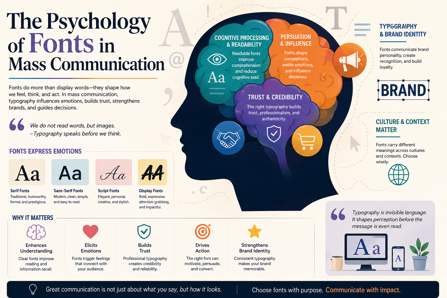
In this article, we consider the psychology of fonts in mass communication, such as how different fonts can affect emotions, perception, trust, and branding. This will assist communicators in using fonts to appeal to their audience.
Fonts in Mass Communication
Fonts Express Emotions
Fonts have emotional power. Each font has a personality dictated by its characteristics: the thickness, the shape of the curves, the structure, and proportions. These transmit a state of mind that impacts us. For example, serif fonts are considered traditional and prestigious. They are highly decorated, making them look old-fashioned, and are found in traditional forms of media such as books, newspapers, and high-class branding.
By contrast, sans-serif fonts are seen as contemporary, efficient, and simple. They are more legible, especially when read on a screen, and are widely used on websites and in technology branding. It is this simplicity and modernity that has earned sans-serif fonts their popularity. However, their simplicity can sometimes be off-putting.
Script fonts are decorative fonts. They are often hand-lettered, adding glamour, style, and personality to typography, and are often used in invitations, logos, and artwork. But they can create problems if illegible. Stylized fonts can be irritating, confusing, and counterproductive, particularly in a commercial environment where legibility is essential.
Emphasis fonts are stylized and decorative. They are used to draw attention and express excitement, novelty, urgency, and nostalgia. They can be used in titles and ads, but sparingly so as not to overwhelm the reader. Fonts are attractive because they are similar or dissimilar to the message, so it is important to use the right fonts.
Cognitive Processing and Readability
Images are processed very efficiently by the brain, and fonts can be an aid to this. Readability is the capacity to read and understand text, while legibility is the capacity to recognize characters. These are important elements in consumer behavior. Readable fonts are soothing for the reader and increase comprehension.
Readability is important for mass media with high content volume. The correct font will help comprehension and recall, while the wrong font can distract and annoy. This is particularly critical in online media, where the size, resolution, and luminosity of the screen are important factors.
Fonts affect reading performance. It has been shown that the most common fonts are processed quicker than other fonts because there is no extra processing load needed to recognize the shapes of the characters. This allows the reader to feel safe and relaxed and therefore continue reading. However, decorative fonts can be more difficult to process.
Spacing is another component of cognitive reading. This includes how the letters (kerning), lines (leading), and the length of the lines are spaced. If it is right, it will be pleasant to read; if wrong, it will be distracting. Clearly, in this case, there needs to be thought given to what font is used and where.
Fonts as Tools of Persuasion
Fonts are a key tool of persuasion in mass media. Fonts can influence our cognitive processes and learning, which can affect our beliefs, emotions, and behaviors. Fonts are used to evoke certain responses and behaviors. For example, narrow and serif fonts can create a sense of urgency and excitement and are commonly used in sales and live news.
However, rounded fonts can evoke feelings of security and safety and are often used in lifestyle, health, and well-being brands. These can affect consumer perceptions and behaviors. Type is one of the many elements of communication, alongside color and images.
Processing Fluency
This ties in with “processing fluency.” The more fluent the information is, the more it will be accepted. This is why it is important to use readable fonts, as they contribute to the probability of a person believing and remembering the information. This may not be the same with unreadable fonts, which may lead to skepticism, even if the information is correct.
Perceived Value Through Fonts
Fonts can play a role in value perception. Luxury brands may use decorative fonts to convey class and luxury, while low-end brands may use simple fonts to convey value and a good deal. This is a recognition of the influence of typography on the mind and behavior of the consumer.
Professionalism, Credibility, and Trust
Trust is important in mass communication, and typography is one of the elements that can create trust. Fonts can communicate professionalism, competence, and trustworthiness, which can influence people’s perceptions of the message. Serif fonts (classical fonts) are trustworthy because they have historically been used in books and other formal documents. They are considered formal and professional.
In contrast, decorative fonts have been shown to decrease trustworthiness, especially in situations where accurate information is important. For instance, a less formal font may convey a lack of trustworthiness in financial advice or medical information. So it is essential that fonts be chosen with context and target audience in mind.
Typographic Consistency
The second element of typography that can convey trust is typographic consistency. Being consistent with fonts across media or platforms helps to establish brand authenticity. This may help convey a professional and trustworthy appearance. Inconsistency in typography can be viewed as unprofessional and untrustworthy.
Typography in the Online Space
Online, where there is much misinformation, typography can help promote trust. On the web, legible fonts can be used to make content more user-friendly and trustworthy. Poor typography can be viewed as untrustworthy, or even misleading, and drive users away.
Typography and Brand Identity
Typography is integral to branding and affects brand recognition. Fonts can communicate certain attributes and express a brand personality. A technology company may use a modern sans-serif font to convey technology and innovation, while a luxury company may use a more ornate script font to convey luxury.
Typography also has a greater impact on branding. Using certain fonts in the branding process creates a more recognizable brand image. This could result in brand recognition and brand loyalty, so typography plays a vital role in branding.
Fonts also help brands communicate to their target market. For instance, young consumers may prefer more vibrant fonts, while older consumers may prefer more traditional fonts. This can help in reaching consumers.
A common modification in a rebrand can be typography based on the attributes of the brand or its consumers. For example, changing from traditional to modern typography can make the brand image seem modern and up-to-date. These are examples of how typography can shape brand image.
Cultural and Contextual Influences
Typography is not only dependent on the choice of font, but also on cultural and contextual factors that may affect the way the font is viewed. Fonts can symbolize certain meanings or cultural values. For instance, what is considered cool and trendy in one culture may be considered archaic and elitist in another. So it is important to be culturally sensitive when communicating across cultures.
Context and Meaning
Context is also important for typography. Typefaces can take on different meanings. A display font may not be suitable for a report, but may be suitable for an advertisement. A sans-serif typeface might be a good choice for a website but not for a luxury product.
Medium and Font Choices
The medium also has an influence on font choices. Issues of clarity, display, and interaction matter. For instance, fonts suitable for print may not be suitable for digital, and vice versa. It is up to the designer to ensure this balance occurs.
Accessibility Considerations
Considerations for accessibility should also be made. When creating or choosing a font, we should make sure to design for accessibility so that we can communicate with as many people as possible, including those with visual impairments. Readability aids communication and accessibility.
Typography in Mass Communication
Mass communication typography is becoming more dynamic with technological advancements. The web has provided new possibilities for interactive and responsive typography that can adapt to the device, size, and viewer. For example, variable fonts can vary in weight, width, and other features to help with communication.
Big data and artificial intelligence are also being applied to typography. This will help designers understand human behavior and decision-making when it comes to fonts. This then improves their communication and audience interaction.
But typography principles still apply. Typography psychology is still based on human perceptions and emotions. The psychology of fonts will remain essential for successful communication, regardless of the media.
Conclusion: Fonts in Mass Communication
The psychology of fonts in mass communication focuses on the effects of typography in mass media on perception, understanding, and memory. Typography is both aesthetic and functional, as it elicits emotions, authenticity, and brand identity. By understanding the impacts of psychological and cultural variables on typography perception and design, mass communicators can choose fonts and typography that best enhance communication and its outcomes.
Typography is a major element in crucial communication processes such as emotion, cognition, and persuasion. Because of its subconscious effects on purchasing behavior, it is an important element of advertising, media, branding, and other areas of mass communication. Typography will increasingly become an important part of our digital world and a vital element of mass communication.