Abstract
The production of newspapers goes beyond the newspaper reporting and writing; it is a conscious visual arrangement that influences the way the audience perceives information. Layout and page design are critical forms of communication that establish readability, hierarchy, and involvement with the audience in print and digital journalism. This paper discusses the basics of newspaper page design and layout, with special attention to the headline positioning, column structure, typeface, use of images, and white space. The paper is based on the visual communication theory and journalism production scholarship, detailing how layout structures facilitate the attention of the reader and promote understanding. The article utilizes academic literature, qualitative analysis and newsroom practices to prove that proper layout enhances storytelling, makes the material more accessible, and more credible as developed by the editorial team. The results indicate that contemporary digital tools are beginning to follow the culture of traditional print layout with the principles of continuity over replacement. The paper comes up with a conclusion that effective journalism requires not only proper reporting but also effective visualization that promotes cognitive processing and navigation by the reader.
Keywords: page design/ layout, visual hierarchy, newstype, page layout, newsroom design, readability of media.
1.0 Introduction
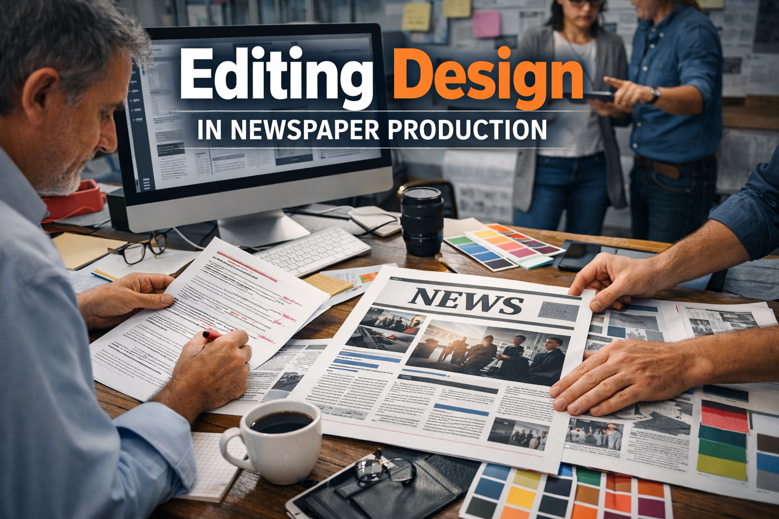
Journalism conveys the message by word and image. As reporters collect and compose news articles, page designers take the information and make it presentable in visually friendly formats that shape the reader and their perception of the content. The headlines, images, and columns are arranged in a way that makes or breaks the audience’s interest in the news stories.
Newspaper page design and layout have changed in past, where it was done manually through paste-up systems to digitally organised production systems. In the modern world, editors use visual hierarchy and layout structures to control the focus of viewers. The design material, like the templates of a professional newspaper, shows how the clear structure of a presentation can facilitate more effective storytelling.
With the audience getting more and more news on the multi-platforms, proper layout has become the focal point of journalistic achievement. This paper examines principles, theories and applications of page design in detail, explaining the ways visual arrangement enhances readability and helps maintain the involvement of the audience in the modern media settings.
2.0 Literature Review
The studies of the newspapers’ design always focus on the interaction between visual display and the behavior of the readers. Garcia and Stark (1991) discovered that when readers scan pages, they usually evaluate the importance of the articles they are reading by relying on visual information, including headlines and pictures. Their eye-tracking study made layout one of the main factors that defined the patterns of reading.
Harrower (2012) is of the opinion that newspaper design serves three fundamental roles, namely, attracting attention, organization of content and credibility. This school of thought states that layout choices are editorial and not ornamental.
Barnhurst and Nerone (2001) investigated the historical trends in the looks of newspapers and found that design development is a manifestation of evolution in journalism values such as ease of use and appeal to the audience. On the same note, Lester (2014) proved that visual hierarchy allows visual processing of complex data, as well as visual association, by providing structured information.
Newer literature points towards convergence between print and digital journalism. According to Kung (2017), digital platforms modify the traditional layout principles, including grids and hierarchy, to support the behavior of scrolling and reading on a mobile platform. All these studies support the notion that the concept of good design of the pages will continue to form the main basis of news communication irrespective of the change of technology.
3.0 Conceptual Review: Page Design and Layout of Newspaper
3.1 Concept of Visual Hierarchy
Visual hierarchy is a system whereby things are classified in terms of importance. Designers employ the size, position, contrast, and typography to indicate the stories that must be given instant attention. The page is usually dominated by lead headlines, which lead readers to major news content, as compared to secondary stories.
3.2 Concept of Balance and Alignment
Balance makes sure that there is a balance of visual elements on a page. The balance is symmetrical or asymmetrical so as to avoid clutter and aesthetic stability. Alignment also coordinates content by establishing structural lines that are invisible and joining the headlines, pictures, and blocks of text.
3.3 Concept of Modularity
The news is arranged into a modular design that has a rectangular structure. This is a method that makes navigation easier and enables it to be rearranged freely in the production process. Modular layouts are also useful in maintaining consistency through editions and in being able to adapt digitally.
3.4 Concept of Readability and Navigation
Readability entails textual clarity and visual accessibility. Good designs usher the reader through their natural flow, headline, article, body and other related features, including captions or sidebars. The navigation clues made by distance and orientation minimise the confusion and cognitive load on the reader.
3.5 Headline Placement and Ranking
Headlines serve as points of entry to news items. The main headline is usually displayed at the top so that the message is immediately attracted. Secondary headlines give complementary frameworks and do not challenge visually.
Appropriate headline hierarchy:
- The significance of signals editorial.
- Promotes scanning behavior.
- Establishes reading order.
The organization of headlines is ineffective and makes them less engaging.
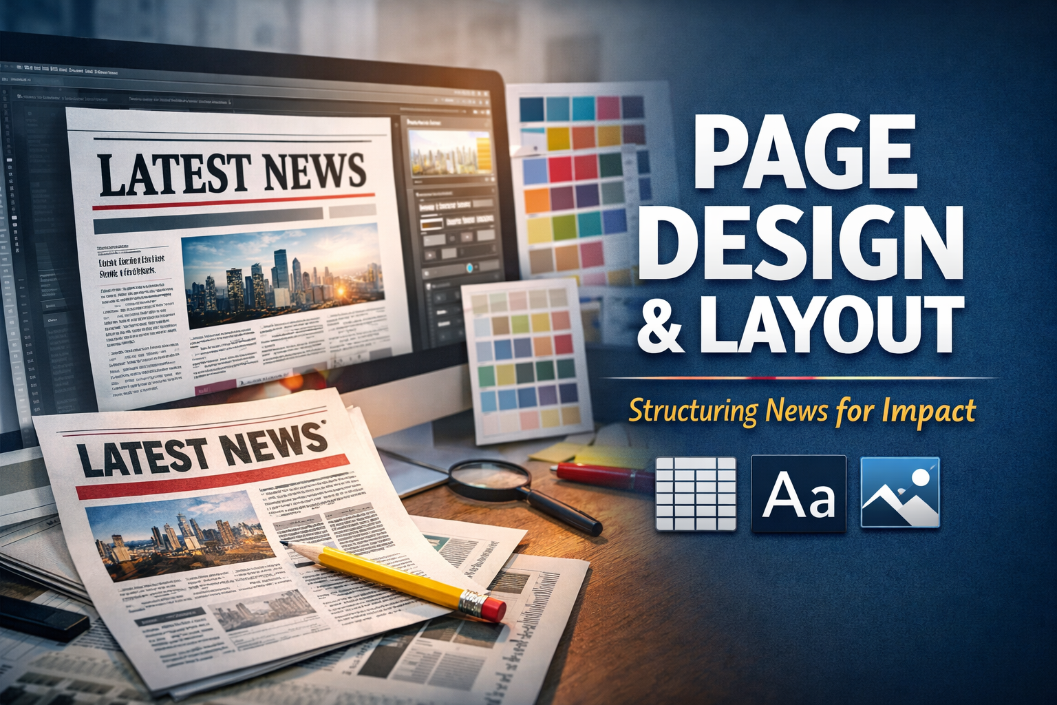
3.6 Structures of Columns and Grids
The newspaper layout is based on column structures. In traditional broadsheets, several slim columns are placed to enhance readability by reducing the length of the lines. Grid systems offer consistency and alignment of pages.
Digital news platforms recreate grid structures via responsive designs that adapt to the screen size with hierarchy.
3.7 Typography in News Design
Typography conveys a tone and trustworthiness. Serif fonts are usually used in the body of newspapers because they are readable in long texts, whereas the headlines are emphasized by using another font called the sans-serif fonts.
Some of the typographic principles are:
- Legibility across sizes.
- Consistency in font usage.
- Highlighting of headline and body text.
Good typography is organized, which lowers the level of fatigue and contributes to professionalism.
3.8 Employment of Imagery and Visual Effects
Photos are captivating and offer emotive background. Photographs are not supposed to act as editorial information, but just complement it.
3.9 White Space and Visual Breathing Room
The term white space is used to denote the spaces between parts of the design. White space enhances clarity and readability, contrary to the misconceptions.
Benefits include:
- Reduced visual clutter.
- Improved focus.
- Enhanced comprehension.
4.0 Theoretical Review
4.1 Gestalt Theory of Visual Perception
The Gestalt theory of visual perception (4.1) suggests that objects are perceived as bundles of identical perceptual experiences, a theory that has been demonstrated to be both accurate and relevant in science. Gestalt theory of visual perception (4.1) is a theory that objects can be viewed as a combination of the same experience of perception, a theory that has also proved to be correct and applicable in science.
The Gestalt theory suggests that people look at the visual compositions as unitary instead of discrete. The proximity and similarity principles help designers to cluster related stories. When the headlines and pictures are placed near each other, the readers perceive them as related information.
4.2 Visual Hierarchy Theory
Visual hierarchy theory is a theory that describes the effect of prominence on attention. The readers are first attracted by larger fonts, bold headlines, and predominant imagery. The visual weight is purposefully controlled to establish the order of reading by designers and prioritize editorial interests.
4.3 Cognitive Load Theory
The cognitive load theory postulates that when visual complexity is too high, understanding is minimized. Too many pages of the newspaper drive readers away and fill them with details. The use of structured layouts, uniform typography and effective use of white space relieves brain effort and enhances comprehension.
5.0 Methodology
This research uses a qualitative assessment in the form of:
- Academic literature review regarding visual communication and journalism design.
- Analysis of professional newsroom layout.
- Comparison between print and online newspaper versions.
The discussion reveals common principles, which make the document more readable, engaging to the audience, and understandable of the information.
6.0 Findings
The analysis shows that there are a number of common trends:
- The way the reader looks at the page is visual then the text is read.
- High hierarchy enhances engagement to a great extent.
- The modular grids provide a better organization and efficiency.
- Typography has an effect on credibility.
- Blank spaces enhance understanding.
- There are similar principles of layout in print and online.
7.0 Discussion
The results affirm that layout acts as a cognitive guide to the readers. The shift in journalism to digital platforms is making visual organization even more relevant as people have shorter attention spans and read more on the phone.
Professionally laid out pages in a credible manner enhance credibility since it provides information in a clear manner. On the other hand, poor layouts can destroy trust in spite of the quality of reporting. The current newsroom practice thus involves the cooperation of editors, designers and the digital producers to provide visual coherence across platforms.
Moreover, the availability of design tools has made the production of newspapers more democratic and thus smaller organizations can embrace professionalism. Nevertheless, a template still cannot substitute editorial judgment; however, the knowledge of layout principles is also necessary.
8.0 Conclusion
Newspaper page design and layout form part of good journalism. By creating a well-organized hierarchy, typography, image, and white space, designers are able to make written information available as visual storytelling. The visual perception and cognitive psychology theoretical perspectives clarify the benefits of layout structure in improving the understanding and involvement of readers.
Clarity, balance, and readability are also the same principles as the media consumption keeps transforming. Effective journalism can be measured by proper reporting as well as appropriate visual presentation that can take audiences on an effective tour of complex details.
References
Barnhurst, K. G., & Nerone, J. (2001). The form of news: A history. Guilford Press.
Garcia, M. R., & Stark, P. (1991). Eyes on the news. Poynter Institute.
Harrower, T. (2012). The newspaper designer’s handbook (7th ed.). McGraw-Hill.
Küng, L. (2017). Strategic management in the media. Sage Publications.
Lester, P. M. (2014). Visual communication: Images with messages (6th ed.). Wadsworth.