In the digital age, visuals dominate every corner of communication, shaping how we perceive brands, people, and products. From scroll-stopping social media posts to high-impact commercial campaigns, the quality of your images speaks volumes. Even the most beautifully composed photo can fall flat if its colors are off. Photo color correction is one of the most essential yet often overlooked techniques used to produce professional-grade imagery with accurate tones and visual consistency. This process enhances vibrancy, balances lighting, and removes unwanted color casts to bring out the full potential of every photo. The result is a clean, polished image that feels both authentic and visually engaging.
Why Color Accuracy Matters More Than Ever
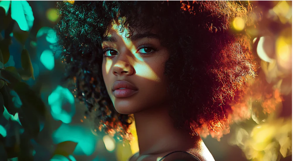
When people view an image, their first impression is usually based on the colors. Accurate color representation builds emotional connections, enhances credibility, and promotes brand identity. For example, an online shopper is more likely to trust and purchase a product that appears true-to-life in color. Similarly, wedding photos that reflect natural skin tones and lighting create lasting emotional impact.
Brands and creatives who care about color accuracy are better positioned to stand out in today’s crowded visual landscape. The ability to present images that “feel right” without looking overly edited can make or break how your work is perceived.
Understanding Color Issues in Photography
No matter how advanced your camera gear is, capturing a perfect image straight out of the camera is rare. Factors like natural lighting, indoor bulbs, weather conditions, and camera settings can create unwanted color casts or imbalances. Some common color issues include:
- Washed-out skin tones
- Overexposed highlights or dark shadows
- Yellow or green tints caused by artificial lighting
- Inconsistent color temperatures in a single shoot
These issues may not be obvious at first glance but become more visible when you place multiple images side by side or when you’re preparing a portfolio or digital gallery.
The Role of Color Spaces and Profiles
Color spaces, such as sRGB, Adobe RGB, and ProPhoto RGB, determine how colors are displayed on screens and in print. A mismatch between color profiles can lead to colors appearing dull or inaccurate when shared online or printed.
- sRGB is the standard color space for web use.
- Adobe RGB has a wider color gamut and is better for printing.
- ProPhoto RGB offers the widest range but must be handled carefully to avoid posterization (color banding).
Choosing the right color space at the start of your editing process ensures consistency across platforms and devices.
Key Techniques for Effective Color Correction
Professionals use a combination of software tools and manual techniques to correct colors accurately. Here are the foundational steps:
1. White Balance Adjustment
White balance defines how warm or cool the colors in an image appear. Cameras often guess white balance incorrectly, especially in mixed lighting conditions. Correcting it manually restores neutral whites and brings balance to the entire photo.
2. Exposure and Tone Corrections
Proper exposure ensures the image isn’t too bright or too dark. Adjusting shadows, highlights, and midtones can bring out hidden details while maintaining natural contrasts.
3. Hue, Saturation, and Luminance (HSL)
The HSL sliders allow you to tweak individual colors without affecting the rest of the image. For example, you can desaturate only the greens in a landscape shot or brighten up the reds in a fashion photo.
4. Curves and Levels
Using curves offers more control over contrast and tonality. With this tool, editors can fine-tune specific color channels (red, green, blue) to target color imbalances precisely.
5. Selective Color Adjustment
This advanced tool allows editors to isolate and adjust specific color ranges. It’s especially useful when dealing with challenging colors, such as skin tones or unnatural lighting effects.
Recommended Tools for Photo Editing
There are numerous software options available for those serious about image editing. Some of the most popular tools include:
- Adobe Lightroom: Ideal for batch editing, white balance, and HSL adjustments.
- Adobe Photoshop: Offers powerful curve, level, and selective color features.
- Capture One Pro: Known for excellent color grading and tethering features.
- Affinity Photo: A more budget-friendly alternative with advanced color tools.
While all these tools offer basic correction features, mastering their advanced settings will significantly elevate the quality of your work.
Presets vs. Manual Adjustments
Presets can be great time-savers, especially when applying a uniform look across a photo series. However, over-reliance on presets may result in inconsistent or unnatural colors, especially under varied lighting conditions. Manual adjustments, although more time-consuming, provide precision and adaptability.
A smart workflow often involves using a preset as a base and then refining the image manually to achieve the desired effect.
Industry-Specific Use Cases
Color correction isn’t just about making photos look “nice” — it’s essential for meeting the needs of different industries:
- Fashion Photography: Skin tones, fabric textures, and background harmony must be perfectly balanced.
- Product Photography: Accurate color ensures that items match what consumers see online and receive in real life.
- Real Estate: Bright, inviting images attract more interest and give a sense of space.
- Event Photography: Emotion and ambiance are tied to lighting and color — both need to feel authentic.
Each field may require a slightly different approach, but the principles of clean, accurate color correction remain the same.
Tips for Beginners Starting Out
If you’re new to editing, the learning curve can feel steep. Here are a few tips to make the journey smoother:
- Shoot in RAW: This file format retains more color data and flexibility for editing.
- Use a Calibrated Monitor: What you see on screen might not reflect real-world colors unless your monitor is properly calibrated.
- Understand Color Theory: Learn how complementary and analogous colors affect perception.
- Start Small: Focus on adjusting white balance and exposure first before diving into more advanced tools.
Over time, your eye will become trained to detect even subtle color issues.
Staying Creative While Maintaining Accuracy
Color correction isn’t about removing creativity—it enhances it. Once you’ve established a color-accurate base, you can explore creative grading techniques like adding mood, warmth, or cinematic tones. This two-step approach—correct first, then grade—ensures your creative edits don’t compromise technical quality.
Final Thoughts
The difference between a good image and a great one often lies in the colors. By learning how to identify and correct color issues, you gain control over your visual storytelling. Whether you’re working on personal projects or serving high-end clients, mastering this editing discipline opens doors to more professional results and creative freedom.
Color correction isn’t just a technical step—it’s a form of visual communication. And with the right tools and practice, anyone can learn to speak the language fluently.