Designing a landing page for your food brand is more than just choosing the right images and colors. It’s about crafting an experience that speaks to your audience’s tastes, needs, and expectations. In this digital environment, even small missteps can significantly affect your conversion rates, frustrate potential customers, and slow business growth. A landing page is not just a space for visuals, it’s a strategic entry point that can turn curious visitors into loyal customers, provided it’s designed with precision and purpose.
In this guide, we’ll explore five key mistakes to avoid when designing your food brand’s landing page. Each of these errors can undermine the effectiveness of your digital marketing strategy and cause missed opportunities for revenue growth. Whether you’re launching a new product, refreshing an existing campaign, or simply optimizing your digital presence, these best practices will help you strengthen your approach, enhance performance, and reduce wasted spend. If you’ve ever wondered why certain landing pages seem to convert effortlessly while others struggle, this article will provide valuable insights into the common pitfalls that often go unnoticed.
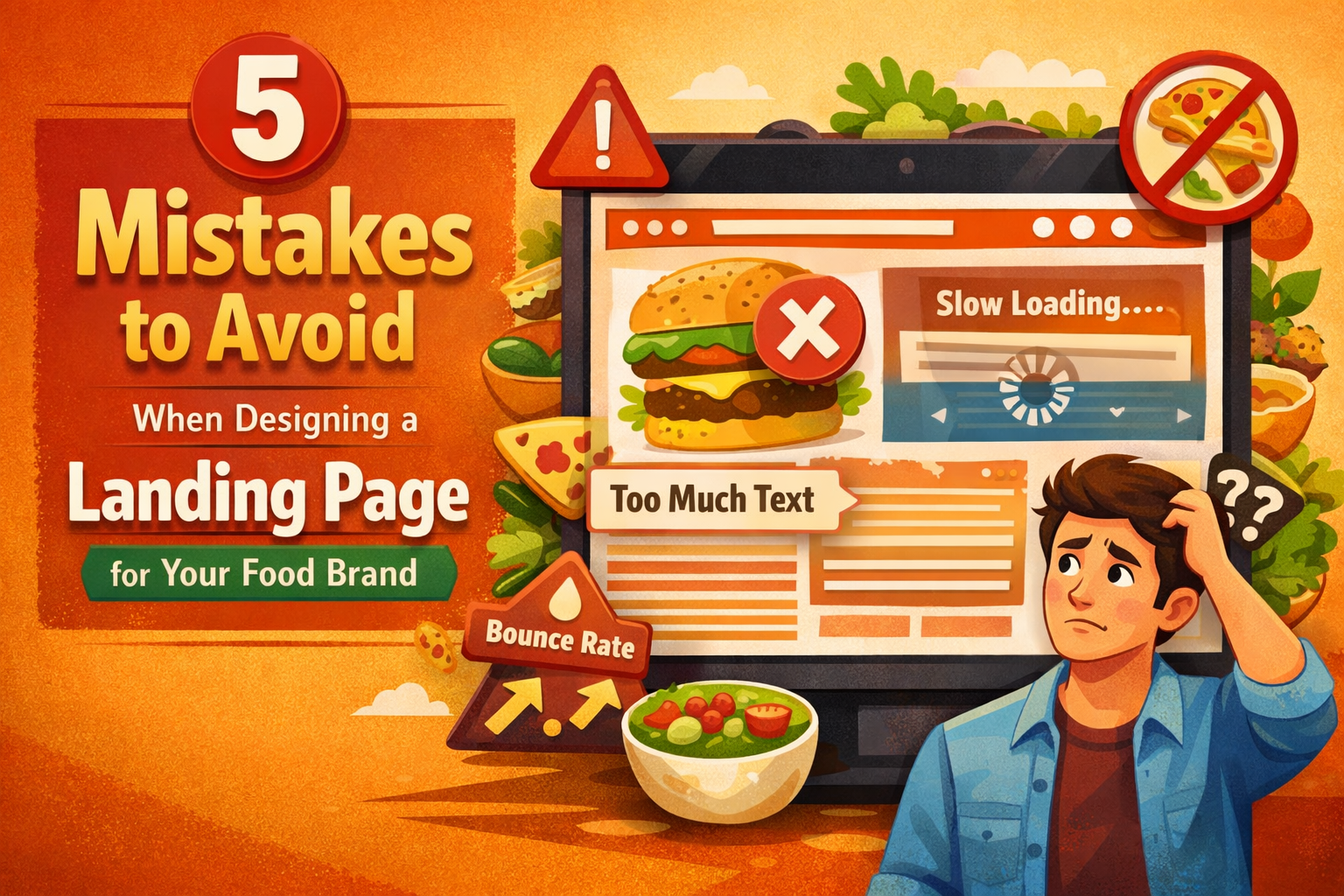
1. Overcomplicating the Design
One of the most frequent mistakes food brands make when designing their landing pages is overcrowding them with too much information. While it’s tempting to include every detail about your products, such as ingredients, benefits, and stories, the reality is that too many elements can overwhelm visitors. When users land on a page and aren’t sure where to look first, they’re more likely to abandon the page and look for something simpler. A cluttered design doesn’t provide the clarity that users need to make a decision quickly.
Effective landing page design should focus on one clear goal and present it through a clean, visually appealing layout. Think of your landing page as a guided experience. The design should support the action you want the user to take. This means prioritizing white space, clear headings, and a logical flow that leads the visitor from attention to conversion. Simplifying your layout doesn’t mean sacrificing creativity; it means choosing what’s most important for the user to know and delivering that information in a digestible way. When working with a New York digital marketing agency, designers will help you strike a balance between creativity and usability, ensuring your landing page stays visually appealing yet conversion-focused.
A minimalist design that emphasizes your brand’s personality and purpose helps visitors feel comfortable navigating your page. Less is often more when it comes to online shopping behavior. By keeping things simple, you remove distractions and allow your audience to focus on what matters: taking action. A streamlined, focused layout ensures your message is heard loud and clear, leading to better engagement and ultimately, higher conversions.
2. Weak or Unclear Calls to Action (CTA)
The call to action (CTA) is arguably the most important part of your landing page. It’s the moment when you ask your visitor to take the next step, whether that’s signing up for a newsletter, placing an order, or downloading a recipe guide. However, many food brands make the mistake of using generic CTAs like “Submit” or “Learn More,” which fail to inspire immediate action. These vague CTAs don’t give visitors a compelling reason to click, which can result in lost opportunities.
A strong CTA should be specific, benefit-oriented, and prominently placed within the layout. Phrases like “Get Your Free Recipe Guide,” “Order Fresh Meals Now,” or “Taste the Difference Today” make it clear what action the user should take and what they will gain from doing so. These CTAs also align with the goals of the landing page by focusing on the benefits that your product provides, rather than just directing users to more content. Additionally, placing your CTA in multiple strategic locations, such as near the top of the page and after persuasive content, ensures visibility and increases the likelihood of action. Working with a digital marketing company in New York can help optimize CTA placement, copy, and design by using A/B testing to find the best-performing elements for your page.
When designing a landing page, always consider the psychology behind CTA placement. The button should be visible and inviting, with contrasting colors that draw the user’s attention. Make sure the text is clear and action-oriented so that visitors know exactly what to expect once they click. An effective CTA ensures a seamless user experience, guiding visitors smoothly toward their desired action, and driving conversions in the process.
3. Ignoring Mobile Optimization
With more consumers browsing and purchasing on mobile devices than ever before, neglecting mobile optimization is a costly mistake. A landing page that looks great on desktop but is difficult to navigate or loads slowly on mobile will frustrate users and send them straight to your competitors. For food brands, where impulse decisions are common, every second of load time and every inch of screen space matters. If your landing page doesn’t provide an exceptional mobile experience, you’re likely to miss out on a large portion of potential customers.
Mobile optimization goes far beyond simply resizing your desktop page for smaller screens. Mobile-friendly design should ensure that buttons are easy to tap, text is readable without zooming, and images load quickly to avoid frustrating delays. A responsive design means the page layout adapts to different screen sizes, creating a seamless experience on smartphones, tablets, and desktops alike. Regular testing across various devices ensures that users have a smooth and enjoyable browsing experience no matter what device they’re using. By partnering with a digital marketing agency, you can ensure your landing page is fully optimized for mobile, offering a fast, smooth, and conversion-focused experience that encourages users to engage with your food brand.
For food brands, where a visual connection to the product is critical, ensuring that your images, menus, or offerings appear crisp and fast-loading on mobile devices is essential. By reducing load times and making navigation simple, mobile-optimized pages increase the chances that users will not only stay longer but will convert faster. Mobile design should feel intuitive, giving users what they need without unnecessary clicks or obstacles. When users enjoy a hassle-free experience on their mobile devices, they’re more likely to make a purchase or continue browsing your offerings.
4. Neglecting Visual Storytelling
Food sells with the senses, and your landing page should reflect that through strong visual storytelling. One of the biggest mistakes brands make is using generic stock photos or visuals that don’t align with their unique identity. Bland or irrelevant images fail to evoke emotion or appetite, making it harder for visitors to connect with your products on a deeper level. To build a connection, your visuals should tell the story of your food, from the sourcing of ingredients to the moment the dish is served at the table.
Effective visual storytelling in the food industry means more than just featuring pretty pictures, it’s about capturing the essence of your brand and your products. Invest in high-quality photography that showcases your food in its most enticing form: fresh ingredients, beautifully plated dishes, and customers enjoying your meals. These visuals should communicate the quality, flavor, and lifestyle your food brand represents. Pairing these images with short captions or microcopy that explains the story behind the dish or the ingredients adds context and makes the experience feel more authentic. By creating a visual narrative, you engage visitors’ senses and emotions, which is crucial in the food industry.
Visual storytelling creates a lasting impression that keeps visitors engaged with your content. It helps potential customers imagine themselves enjoying your product and encourages them to take action. Strong, relatable imagery enhances the overall user experience, making the landing page memorable and inviting. Remember, food is all about taste and experience, and your landing page visuals should communicate that experience clearly and compellingly.
5. Forgetting to Build Trust and Credibility
Trust is essential in any online buying decision, especially for food products where quality and safety are essential. Visitors landing on your page want reassurance that your offerings are worth their attention and investment. Yet, many food brands overlook the importance of building trust and credibility, leaving visitors uncertain about the authenticity of the brand and the quality of the products.
To foster trust, integrate social proof such as customer testimonials, reviews, and ratings. Short, specific quotes from satisfied customers, particularly those that praise taste, quality, or service, can go a long way in influencing purchase decisions. You can also display trust signals such as secure checkout badges, satisfaction guarantees, or links to third-party review platforms that verify your claims. Being transparent about your brand’s values and ethical practices also helps to build trust, especially in today’s market where consumers are increasingly concerned with sustainability and responsible sourcing.
Including clear and accessible contact information, such as an email address or phone number, provides further assurance to visitors that they can easily reach out if they have questions or concerns. When visitors feel confident that your food brand is authentic, transparent, and credible, they’re more likely to complete the desired action on your landing page. Trust signals are often the deciding factor that pushes hesitant visitors into becoming paying customers.
Conclusion
Designing an effective landing page for your food brand requires a strategic blend of art, science, and user empathy. Avoiding common pitfalls like overcomplicated designs, weak CTAs, poor mobile optimization, lackluster visuals, and missing trust signals can dramatically improve engagement and increase conversions. By focusing on simplicity, user-centered design, and building credibility, you ensure that your landing page not only looks great but performs well.
Whether you choose to handle the design yourself or work with a professional, these guidelines will help you create a landing page that strengthens your food brand’s presence and drives real results. A thoughtful, compelling landing page can turn curious visitors into loyal customers, driving growth and success for your food brand. Keep testing, stay focused on user experience, and your landing page will become a powerful asset in your digital marketing strategy.