Color is not just a visual element; it’s a powerful tool that communicates emotions, influences decisions, and shapes perceptions. In the realm of logo design, color serves as a silent ambassador of a brand, connecting with audiences on a subconscious level. Understanding color psychology is essential for creating logos that not only look good but resonate deeply with the target audience.
Why Color Matters in Logo Design
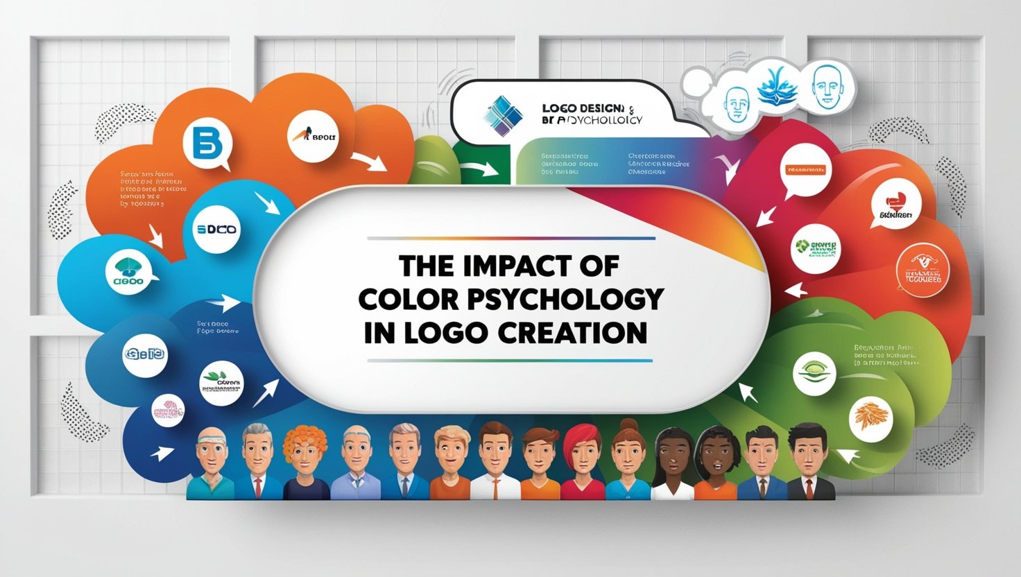
Colors evoke emotions and associations that can influence how a brand is perceived. For instance:
- Red symbolizes passion, energy, and urgency. It’s often used by brands aiming to evoke strong emotions or grab immediate attention.
- Blue conveys trust, reliability, and professionalism, making it a favorite in industries like finance and technology.
- Green is associated with growth, health, and sustainability, ideal for eco-friendly or wellness-focused brands.
- Yellow radiates optimism and happiness, creating a sense of positivity and warmth.
- Black and White reflect sophistication, simplicity, and timelessness, often chosen by luxury or minimalist brands.
The Psychological Connection
The impact of color goes beyond aesthetics. It can:
- Trigger Emotional Responses
Colors tap into emotional triggers, helping brands establish an immediate connection with their audience.
- Influence Consumer Behavior
Studies show that up to 90% of snap judgments about products can be based on color alone.
- Enhance Brand Recognition
Consistent use of specific colors improves brand recall, making logos more memorable.
- Set Industry Expectations
Certain colors are subconsciously tied to specific industries, such as blue for technology or green for environmental sectors.
Crafting a Logo with Color Psychology
When designing a logo, the strategic use of color is crucial to align with the brand’s message and audience. Here’s an approach to consider:
1. Understanding the Brand Identity
Before selecting colors, it’s essential to delve into the brand’s values, mission, and target audience. This helps ensure the chosen palette authentically represents the brand’s essence.
2. Analyzing the Target Audience
Different demographics respond to colors differently. For example, younger audiences may favor vibrant and bold hues, while mature audiences may prefer subdued and classic tones.
3. Studying Competitor Trends
A thorough analysis of competitors’ logos ensures the chosen colors help the brand stand out without straying too far from industry norms.
4. Selecting Complementary Colors
Effective logos often use a combination of primary and secondary colors to create contrast and balance. Harmonious color pairings enhance visual appeal.
5. Testing Across Mediums
Colors can appear differently on various platforms and materials. Rigorous testing ensures the colors remain consistent and impactful across digital and print formats.
Common Mistakes to Avoid
- Ignoring Cultural Significance
Colors carry different meanings in different cultures. A color that symbolizes prosperity in one culture may have negative connotations in another.
- Overloading with Colors
Using too many colors can dilute a logo’s impact. Simplicity and focus are key.
- Neglecting Accessibility
Colors should be chosen with inclusivity in mind, ensuring visibility and clarity for all audiences, including those with color blindness.
Real-World Examples of Effective Color Use
- Coca-Cola (Red)
The vibrant red evokes excitement and passion, aligning with the brand’s lively and youthful energy.
- Starbucks (Green)
The calming green reflects sustainability and a connection to nature, perfectly suited to the brand’s eco-conscious ethos.
- IBM (Blue)
The solid blue conveys trust and innovation, reinforcing the company’s position as a leader in technology and business.
Conclusion
Color psychology is a cornerstone of impactful logo design. By understanding how colors influence emotions and perceptions, brands can create logos that establish lasting connections with their audience. The strategic use of color enhances brand recognition, communicates values, and ensures logos remain memorable across diverse platforms.
If you’re looking to craft a logo that captures the essence of your brand through thoughtful color selection, consider collaborating with Veracity Design Studio who understand the science and art behind impactful design.