
Most WordPress menus don’t fail because someone “didn’t design them nicely.”
They fail because they quietly grow into a junk drawer.
One new service page gets added. Then another. Then someone adds “Resources,” “Solutions,” “What We Do,” and “Services” (all meaning the same thing). Before you know it, the menu is doing the opposite of its job: it’s making visitors think harder.
This guide is for the practical stuff:
- How to customize WordPress menus properly (classic and block themes)
- How to keep menus from getting messy later
- What to tweak for mobile, clarity, and accessibility
- When it’s smarter to stop hacking and implement it cleanly
No fluff. Just things you can actually do today.
Step 1: Figure out which type of menu you’re editing
This sounds obvious, but it saves time.
If you see: Appearance → Menus
You’re using the classic menu system. You build a menu, assign it to a location (Primary/Header), and the theme outputs it.
If you see: Appearance → Editor
You’re on a block theme (Full Site Editing). Menus are usually handled inside the Navigation block in the Header template.
If you try to “fix the menu” in the wrong place, you’ll feel like WordPress is trolling you.
Step 2: Fix the menu structure first (before styling anything)
Here’s the uncomfortable truth: you can’t “design” your way out of a bad menu.
If the structure is noisy, your menu will still feel confusing even with perfect typography.
A simple rule that works on most business sites:
- 4 to 7 top-level items
- 1 dropdown max (unless you genuinely have a large catalog)
- 1 clear CTA (Contact / Book a Call / Get Quote)
That’s it. If your menu has 11 links, the problem isn’t styling. It’s decision overload.
A menu that usually works:
- Home
- Services (dropdown)
- Work / Case Studies
- Pricing
- Blog
- About
- Contact (CTA)
And yes, you’ll feel tempted to add “Industries,” “Resources,” “Tools,” and “Support” up there too. Don’t. Put secondary links in the footer, sidebar, or inside the Services page.
Menus are not sitemaps. They’re signposts.
Step 3: Customize menus in Classic WordPress (Appearance → Menus)
If you’re on the classic system, here’s what I’d do in the real world.
1) Build a dedicated “Primary” menu
Go to Appearance → Menus, create a new menu called “Primary,” and add only the items you want in the header.
Important: Disable “Automatically add new top-level pages.”
This single checkbox is responsible for so many menus becoming a mess over time.
2) Use “Custom Links” for intent-based actions
Most people only add pages. But “Custom Links” is where menus get smarter.
Examples:
- “Start Here”
- “Book a Call”
- “Compare Plans”
- “Get an Estimate”
These are not just links. They’re nudges.
3) Reorder for intent, not internal pride
Visitors don’t care about your org chart. They care about what they’re trying to do.
If you sell services, “Services” should be early. If you’re product-led, “Pricing” should not be hidden behind a dropdown.
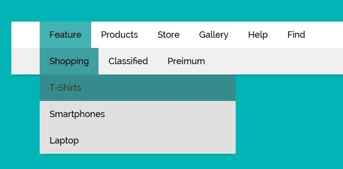
Step 4: Customize menus in Block Themes (Appearance → Editor)
Block themes feel nicer… until you’re trying to control a header across templates.
Here’s the clean path:
1) Open the Header template part
Go to Appearance → Editor → Template Parts → Header.
2) Click the Navigation block
That’s your menu.
From there, you can:
- change labels
- add/remove links
- add dropdowns
- adjust spacing and layout options
3) Don’t overbuild dropdowns
Dropdown menus inside the Navigation block can get clunky on mobile if you go too deep.
If you need nested dropdowns and the theme doesn’t handle it well, don’t force it. Consider simplifying the structure or redesigning how those pages are grouped.
The menu tweaks that actually make a difference (and aren’t “design fluff”)
1) Fix your labels (this is the big one)
If your menu labels are vague, people hesitate.
Avoid:
- Solutions
- Offerings
- Capabilities
Use:
- Services
- Pricing
- Work
- About
- Contact
Your menu should look boring in the best way possible. It’s not the place for creative writing.
2) Make one link feel like the next step
You want one obvious action in the menu.
Examples:
- Book a Call
- Get Quote
- Contact
Make it visually distinct if your theme supports it.
But don’t add three CTAs. That’s how menus become weird and pushy.
3) Check mobile spacing (because most menus fail here)
On mobile, a menu is basically a little decision panel.
If links are too close together, people mis-tap. If dropdown arrows are tiny, they rage-tap. If the menu overlays weirdly, they bounce.
Do a simple test:
Open your site on your phone and try to reach your top 2 pages in under 5 seconds.
If it takes longer, your menu needs work.

Quick accessibility check (simple but important)
Open your site, don’t touch your mouse, press Tab.
If:
- You can’t reach the menu items
- Focus is invisible
- Dropdowns can’t be opened
…then your menu isn’t accessible, and it’s also probably annoying for power users.
Accessibility isn’t just a compliance checkbox. It’s basic usability.
When you should stop tweaking and implement the menu properly
There’s a point where menu “customization” becomes menu “engineering.”
Examples:
- sticky header + smooth behavior without layout shift
- mega menu with icons, descriptions, columns
- role-based menus (logged-in vs logged-out)
- dynamic menus from custom post types
- complex mobile navigation patterns
You can duct-tape these with plugins and random CSS.
But if it’s tied to conversion, navigation clarity, or user experience at scale, it’s usually better done cleanly by a custom WordPress development service so the header doesn’t become the one fragile part of your website that breaks every time you update something.
A practical menu checklist (steal this)
Before you call the menu “done,” run this:
Structure
- Top-level links: 4–7
- Only one dropdown (if needed)
- No dropdown deeper than 2 levels
Clarity
- Labels are obvious (Services, Pricing, Work)
- No duplicate meanings (“Solutions” + “Services”)
Mobile
- Easy to open/close
- Taps don’t feel cramped
- Dropdowns expand smoothly
CTA
- One clear action link (Contact / Book a Call)
If you can check all of those, your menu is already better than most sites.
Final thought
Menus aren’t a branding exercise. They’re a shortcut.
When someone lands on your site, the menu is basically their map. If it’s cluttered, they wander. If it’s clear, they move.
And if you’ve reached the point where you’ve tried three plugins, ten CSS snippets, and your header still behaves weirdly on mobile, you’re not “bad at WordPress.”
That’s just the point where getting help from a custom WordPress development company is the cheaper option compared to continuously patching a navigation system that should’ve been built clean in the first place.