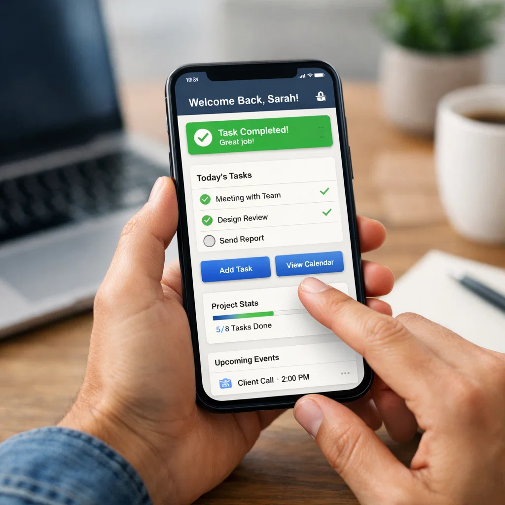
1. Design for the Thumb Zone
Smartphones are getting bigger, but our hands aren’t. Navigating a 6.7-inch screen with one hand can be a gymnastic feat if the interactive elements are placed at the very top of the screen.
The “thumb zone” refers to the area of the screen that a user can easily reach with their thumb while holding the phone in one hand. Modern UI design places key navigation elements, primary buttons, and frequent actions within this natural reach—typically the bottom third of the screen. Reserve the top corners for less frequently used actions, like settings or profile edits.
2. Embrace Minimalism and Negative Space
Clutter is the enemy of good design. When a user opens an app, they should immediately understand what the primary action is. Overloading a screen with too many buttons, images, or blocks of text increases cognitive load, making the app feel overwhelming.
Utilize negative space (or whitespace) to separate elements and guide the user’s eye. A clean, minimalist interface doesn’t mean the app lacks features; it means the features are organized in a way that prioritizes content and readability. Less really is more.
3. Support Dark Mode
Dark mode is no longer just a trendy optional feature; it’s a user expectation. Many users prefer dark themes to reduce eye strain in low-light environments and to save battery life on OLED screens.
When designing for dark mode, don’t just invert the colors. True black can sometimes cause smearing on screens when scrolling, so dark greys are often a better choice. Ensure you check contrast ratios to maintain readability and accessibility. Your app should ideally respect the user’s system-wide settings, switching between light and dark modes automatically.
4. Streamline the Onboarding Process
First impressions matter. If your onboarding process is a tedious slideshow explaining every single feature, users will likely skip it—or worse, close the app entirely.
Adopt a “learn as you go” approach. Let users jump straight into the app and use tooltips or contextual hints to explain features when they interact with them. If account creation is necessary, offer social login options (Google, Apple, Facebook) to make the process one-click simple. The goal is to get the user to the “aha!” moment—the point where they see value in your app, as quickly as possible.
5. Implement Helpful Micro-Interactions
Micro-interactions are subtle animations that provide feedback to the user. It’s the satisfying “bounce” when you pull to refresh, the color change when you toggle a switch, or the loading bar that fills up.
These small details make an app feel alive and responsive. They communicate status and prevent the user from wondering if their tap actually registered. While they should be subtle and not distract from the main task, good micro-interactions significantly enhance the overall feel of quality and polish.
6. Prioritize Accessibility
Designing for accessibility ensures that people with disabilities—including visual, motor, and auditory impairments—can use your app effectively. This isn’t just about altruism; it also expands your potential market reach and is often a legal requirement.
Follow the Web Content Accessibility Guidelines (WCAG). This includes using high-contrast color combinations for text, providing alt text for images, and ensuring your app supports screen readers. Additionally, ensure touch targets (buttons and icons) are large enough to be tapped easily by anyone, regardless of dexterity.
7. Optimize Perceived Performance
Speed is a critical component of UX. While backend optimization is crucial, how the user perceives speed is equally important. Even if data takes a few seconds to load, you don’t want the user staring at a frozen white screen.
Use skeleton screens—grey, pulsing placeholders that mimic the layout of the content—instead of generic spinning wheels. Skeleton screens give the illusion that content is loading faster and provide a visual structure of what is to come, keeping the user engaged during the wait.
8. Simplify Navigation
Navigation should be invisible. Users shouldn’t have to think about how to get from point A to point B. The most common and effective pattern for modern apps is the bottom navigation bar. It clearly lists the 3-5 most important sections of the app and is always accessible.
Avoid hiding core features behind a “hamburger” menu (the three horizontal lines) if possible. While useful for secondary items, hiding primary navigation behind a drawer decreases discoverability and engagement.
9. Transform Empty States
An “empty state” is what a user sees when there is no data to display—for example, an empty inbox, a cart with no items, or a new profile with no posts.
Don’t just leave these screens blank or show a generic “No results found” message. Use this real estate to educate and guide the user. Include a friendly illustration and a clear Call to Action (CTA) telling them exactly what to do next, such as “Start your first project” or “Browse trending items.”
10. Ask for Permissions in Context
We’ve all installed an app only to be immediately bombarded with requests to access the camera, microphone, location, and contacts before we’ve even seen the home screen. This builds distrust.
Instead, ask for permissions only when the user attempts an action that requires them. If a user taps the camera icon to upload a photo, that is the moment to ask for camera access. They are much more likely to say yes because they understand exactly why the app needs it.
11. Personalize the Experience
Creating a successful app is a balancing act. It requires merging aesthetic beauty with rigorous functionality. By adhering to these 12 best practices, you set a strong foundation for an app that users will love to open, navigate, and recommend to others.
Remember that UI/UX is not a “set it and forget it” task. It requires constant testing, feedback gathering, and iteration. Listen to your users, watch how they interact with your interface, and be willing to adapt. The best apps are the ones that grow and evolve alongside their audience.
Short Tips: If you want to design the best mobile apps, you have to follow these instructions.
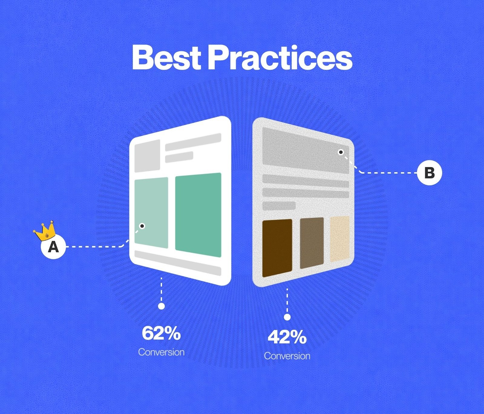
Modern apps should feel tailored to the individual. Personalization can be as simple as using the user’s name in the greeting (“Good morning, Sarah”) or as complex as recommending content based on past behavior.
Leverage data to show users what is relevant to them. If you have a shopping app, highlight categories that they browse frequently. If it’s a fitness app, adjust the dashboard to show their specific goals. Personalization increases emotional connection and makes the app feel like a helpful assistant rather than a generic tool.
12. Utilize Gesture-Based Controls
Swiping, pinching, and long-pressing are second nature to mobile users now. Integrating gesture controls can make your app feel more fluid and modern.
For instance, allow users to swipe right to go back, swipe a list item to delete it, or pinch to zoom in on an image. However, be careful not to rely solely on gestures for critical tasks, as they aren’t always discoverable. Always provide a visible alternative (like a back button) to ensure usability for everyone.
Building Apps That Last
The difference between a viral app and one that sits gathering digital dust often comes down to a single factor: design. Users today are discerning. They don’t just want an app that functions; they demand an experience that feels intuitive, responsive, and seamless. If users struggle to find a button or wait too long for a page to load, they won’t hesitate to uninstall and move to a competitor.
Building a modern app requires more than just clean code. It demands a deep understanding of User Interface (UI) and User Experience (UX) principles. While UI focuses on the look and layout—the colors, fonts, and buttons—UX focuses on how the user feels while navigating the product. When these two disciplines work in harmony, the result is a product that delights users and encourages long-term retention.
However, design trends shift rapidly. What worked five years ago might feel clunky or outdated today. To keep your app relevant and engaging, you need to stay on top of the latest standards. Here are 12 UI/UX best practices that are defining the landscape of modern app development.
Read more on: Globomint