The colour of your watch used to be a detail, a footnote. The case size, the movement, and the brand were the first things you noticed. That order has flipped. Now, dial colour walks into the room first. It speaks before the watch does. It tells a story in half a second. And if you choose well, it keeps telling that story long after trends move on.
Colour is No Longer Decoration
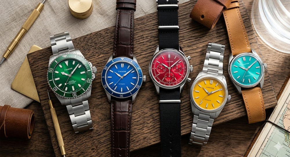
Once upon a time, those dials in women’s watches stayed safe. Black, white, and silver dials were once considered respectable and predictable. Now, colour does something else. It signals confidence, hints at personality, and breaks the uniform without breaking the rules. Brands are already leaning into this change. Not loudly, but thoughtfully.
Blue That Means Business
Blue has always been popular. What’s changed is the shade and the intent.
This season’s blues feel deeper and almost architectural. Think of a navy dial that looks black indoors, then flashes cobalt in sunlight. This type of blue is subtle, catching your attention only upon a second glance. That restraint is the point.
A watch like the Seiko Automatic Blue Dial is a worthy example. On paper, it sounds simple, and on the wrist, it feels deliberate. The blue adds presence without demanding attention. Blue works because it adapts.
- Boardroom friendly
- Weekend appropriate
- Casual but never careless
It’s the colour equivalent of knowing when not to speak.
Green Finds Its Grown-Up Voice
Green used to feel risky, seasonal, and a little playful. Not anymore.
Today’s greens are darker, earthier, and more grounded. Forest green, olive, and British racing green are some examples. These tones feel less like fashion and more like permanence.
Imagine flexing a watch that catches light just enough to show texture, not sparkle. The dial changes character depending on the time of day. Morning green feels crisp, and evening green feels almost black.
The Emporio Armani Three-Hand Date captures that duality well. It feels modern but not trendy. Confident, but not loud. The hue serves as a reminder that colour can evolve over time.
Why green works right now:
| Reason | What It Communicates |
|---|---|
| Depth | You notice it slowly |
| Versatility | Pairs well with neutrals |
| Rarity | Still uncommon enough to stand out |
| Calm confidence | Nothing flashy, nothing forced |
White Is No Longer Boring
White dials have long been misunderstood. These dials are often labelled as plain and safe, missing the nuance that makes them unique.
This season’s white dials feature textures, layers, off-white shades, pearl tones, and additional variations. Instead of colour saturation, they use shadows and reflections.
A clean white dial does something intriguing. It amplifies everything else. You’ll notice:
- The case shape feels sharper
- The indices feel more intentional
- The hands feel more precise
Take a Citizen Eco-Drive White Dial watch. The colour fades into the background, allowing the craftsmanship to step forward. The result feels calm and reliable.
White is not about standing out but about clarity.
When Colour Carries Emotion
The dial colour is not just visual but emotional, too. You do not wear the same colour when you want authority as when you want ease. The colour sets the tone before you say a word.
Here’s how people often respond, whether they realise it or not:
- Blue feels dependable
- Green feels thoughtful
- White feels intentional
The watch does not announce these traits; it merely suggests them. That subtlety is why these colours work.
How to Choose Without Overthinking
Most people make the mistake of matching colours to outfits, but that’s backwards. Instead, match colour to behaviour. Ask yourself:
- Where will I wear this most often?
- Do I want it noticed immediately or gradually?
- Am I building a collection or choosing one watch to live with?
If the answer is “daily wear”, lean conservative but interesting. Blue or white.
If the answer is “personal statement”, green becomes compelling.
A simple rule that helps: if the dial still looks appealing in low light, it’s probably a smart choice.
Colour and Longevity
Trends burn fast, and a colour can date a watch quickly if it tries too hard. That’s why this season’s most successful dials share one trait: restraint.
There are no neon gimmicks or novelty shades that become outdated within a year. The colours feel anchored, as if they belonged to the watch rather than the moment. Brands like Seiko, Citizen, and Tissot understand this balance. Their colours evolve slowly, and their patience shows.
That Quiet Advantage of Colour
Here’s the thing most people miss. A vibrant dial does not need to shout, but needs to hold attention for one extra beat.
When someone takes a second look at your wrist, the colour has done its job. It’s not about being loud, but about being right.
Wrapping Up
The best watches this season don’t rely on complications or size to impress. They rely on tone.
The blue colour deepens, the green colour settles, and the white colour sharpens everything around it. The dial becomes the story, not the accessory, and that’s when colour stops being decoration and starts becoming design.

